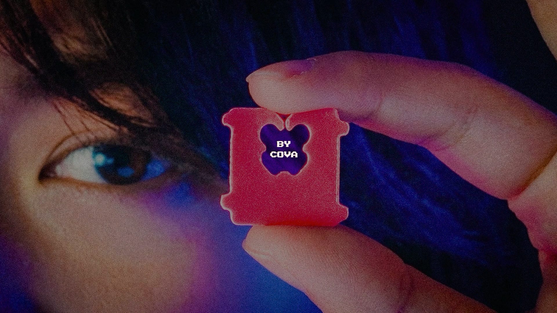
Something big is happening in the smallest of objects.
Bread tags became art.
Receipts became culture.
Care labels became brands.
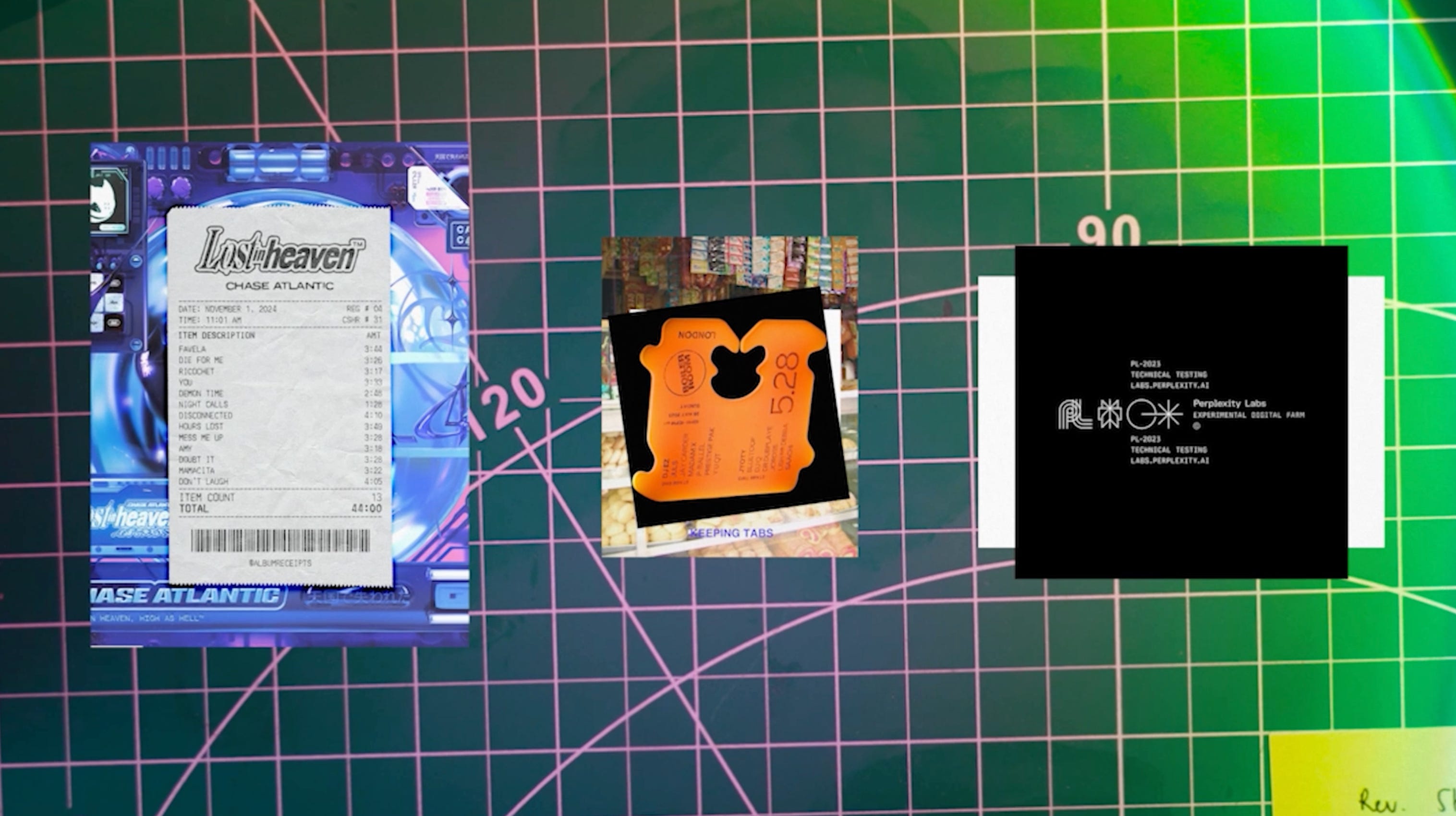
And once you see it, you can’t unsee it.
People are making posters from guest checks, designs from baggage tags, portfolios out of everyday scraps.
We’ve become obsessed with these small, overlooked objects. But why?
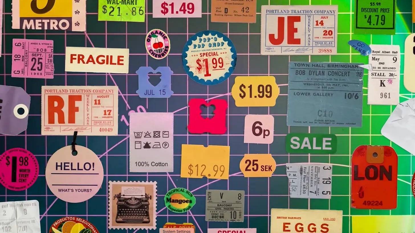
so, what are these objects?
It turns out they already have a name--actually, many names.
We’ve called them:
Ephemera: things that are not meant to last.
Micrographics: the tiny functional labels themselves.
Industrial design: the design of objects made for everyday use or mass production.
But the fact that there are so many names is interesting. It’s always a sign: culture is shifting.
While there are many names, I think the most fitting might be micro design: the design of small, honest objects.
There are three main criteria.
First, every mark matters. Every bit of text, color, and layout is there to do a job.
Second, it’s made of raw materials. A bread tag is cheap plastic; a receipt is unprocessed thermal paper. Microdesign doesn’t hide its core nature.
Third, it’s as small as it can be.
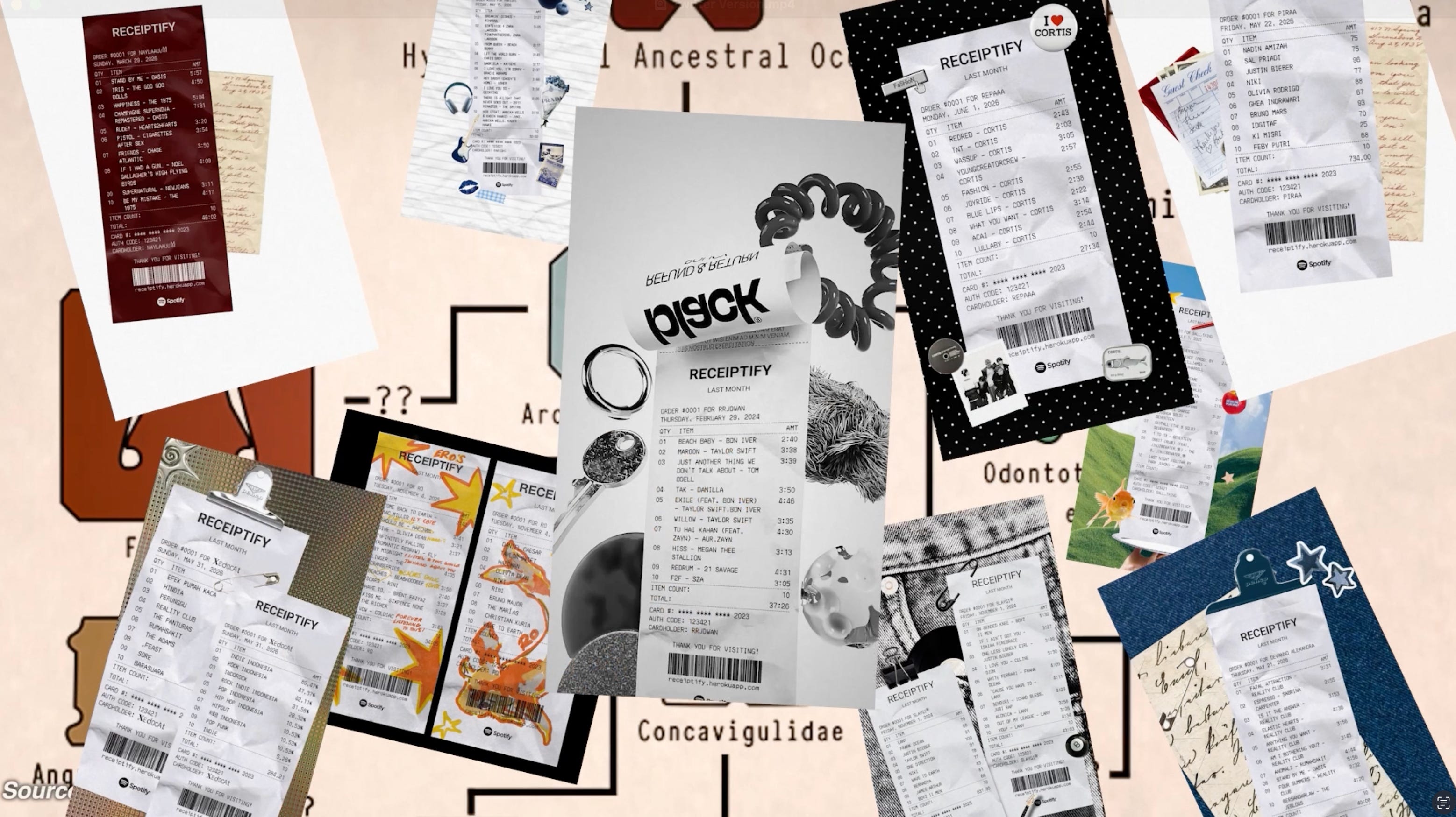
Now, let’s take a look at some specimens. Because, oh, do they have lore.
Bread tags became art.
Think about when you’re at the grocery store. You want to buy some bread, but what you haven’t noticed is the bread clip on it.
Every mark matters. A date is stamped across the front, and the color isn’t a style choice—it’s a code that tells the grocery stocker which day the bread came in.
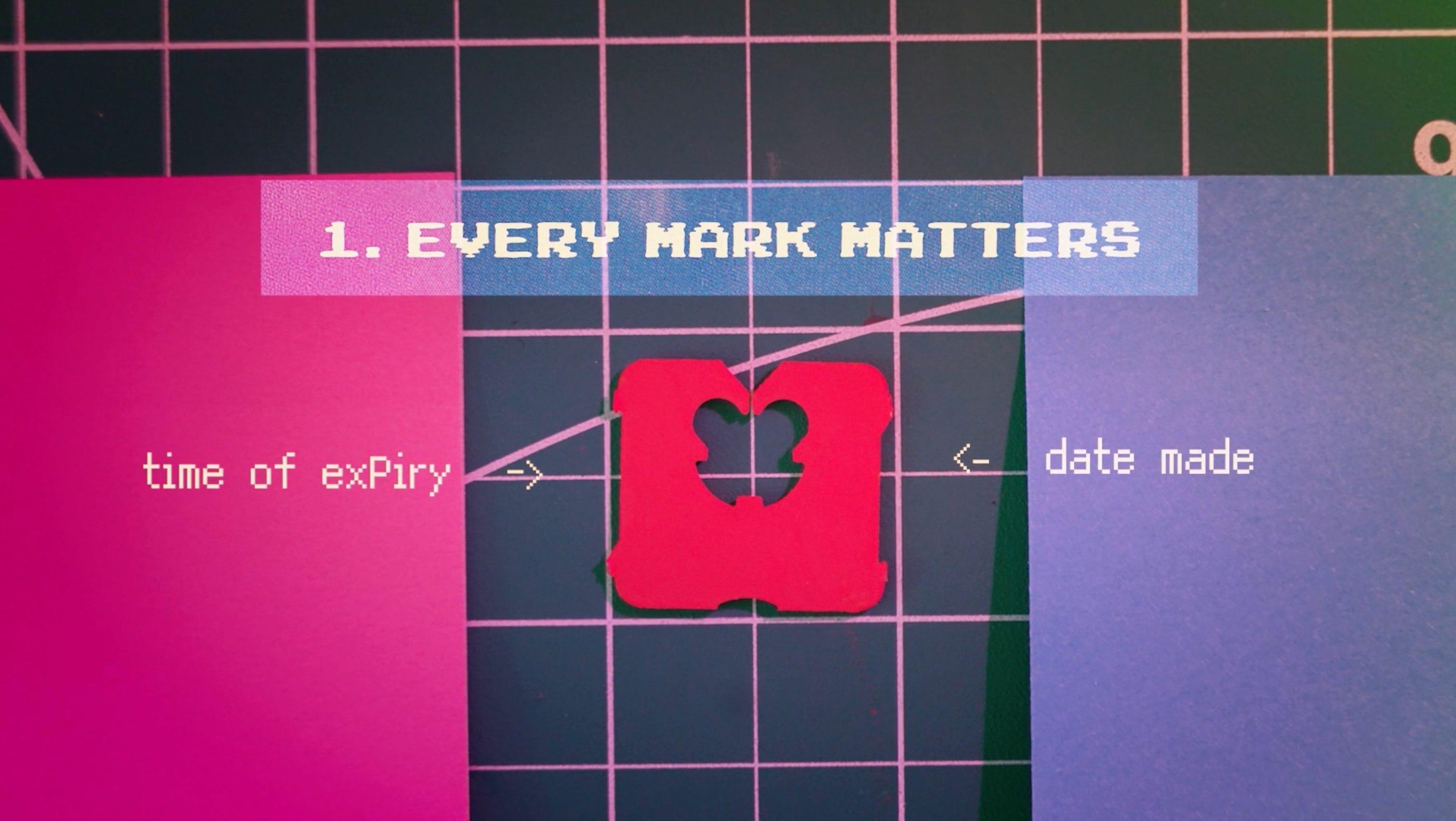
It’s made of raw materials.
And it’s as small as possible: so small you probably don’t notice it at all.
Maybe you’ve held a hundred bread clips and never noticed one.
Yet lately, the humble bread clip has become art.
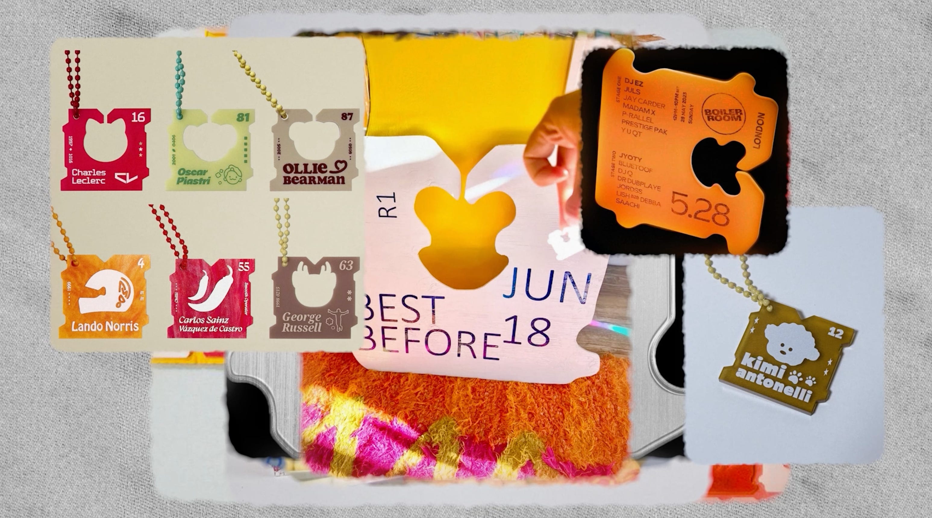
Artists are illustrating with them, crafting with them, and merging them with the visual languages of massive fan cultures like F1 and K-pop. This obsession got big.
By early 2025, the internet had an entire ecosystem of bread-clip artists: giant bread clips, bread-clip chandeliers, bread-clip coffee tables, bread-clip hair clips. And people are calling bread clips a new species.
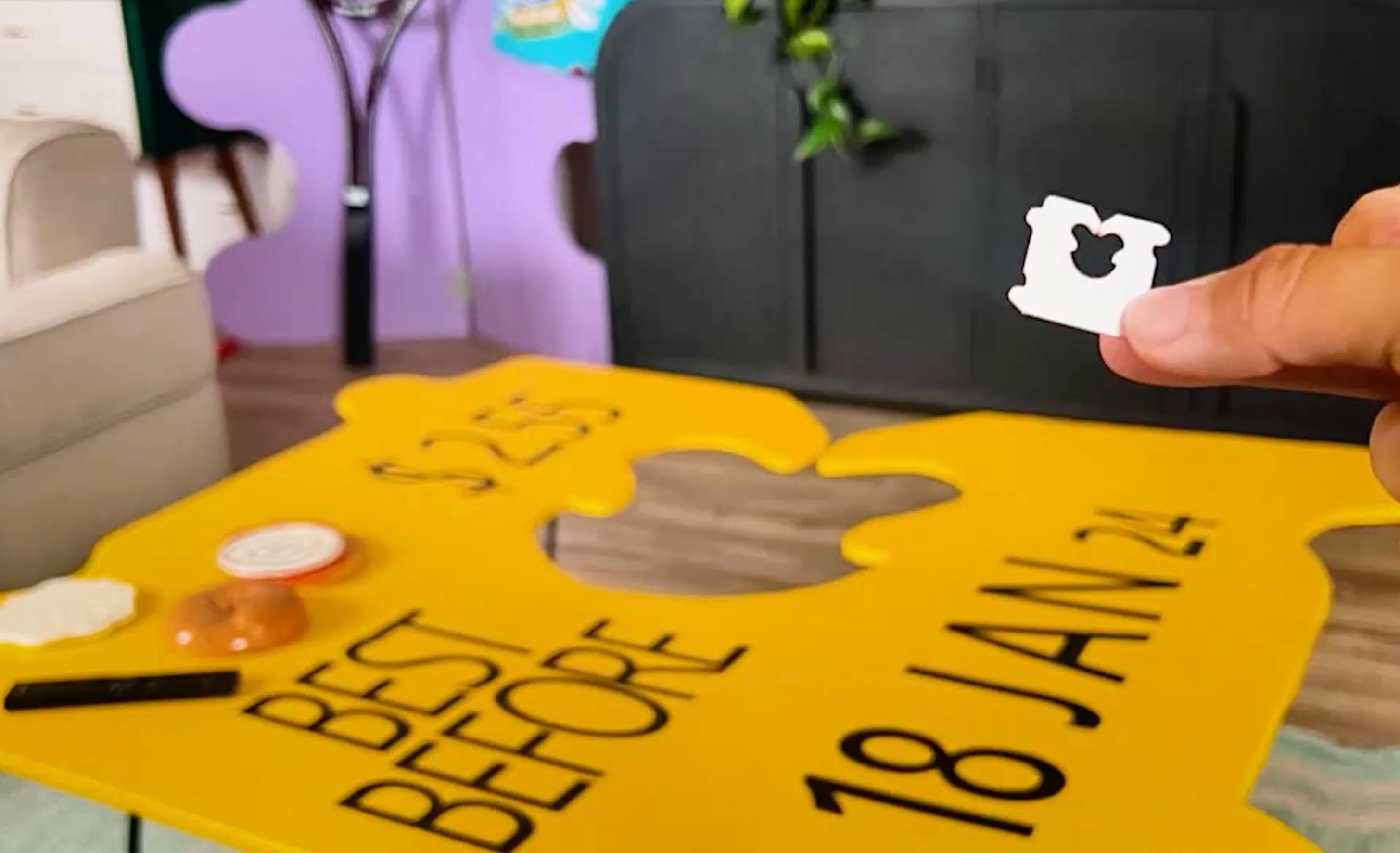
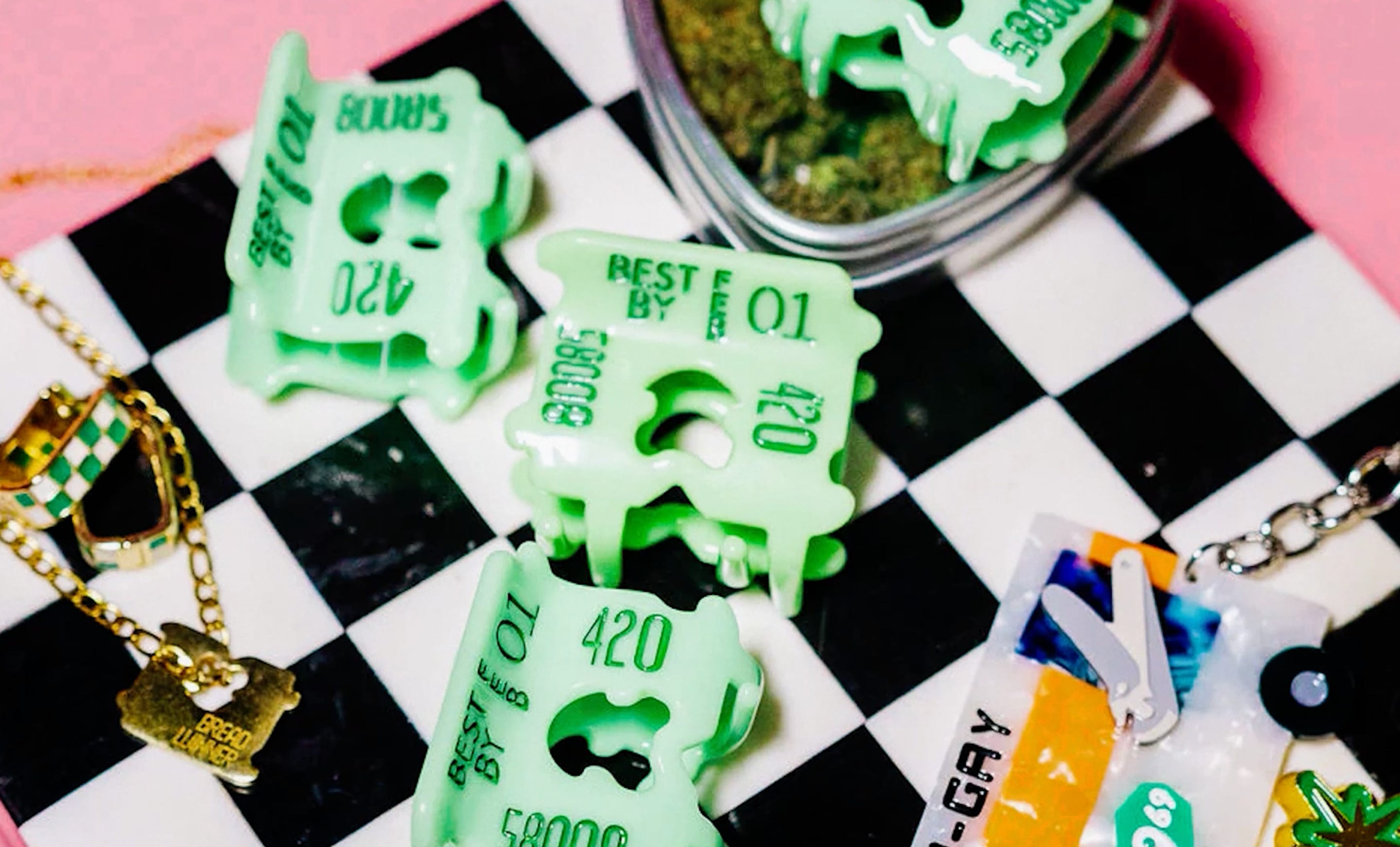
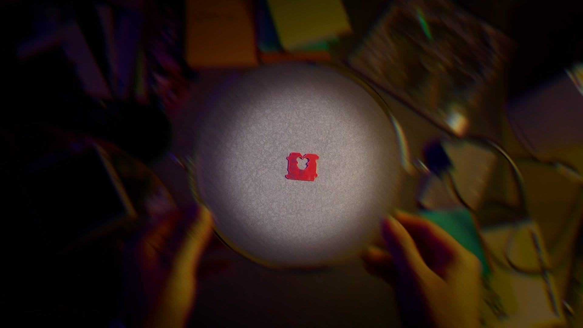
Yes, you heard that right: a new species, called occlupanids.
It all started with this very strange, very beautiful website called HORG. It was basically a spoof scientific organization that classified bread clips as if they were actually a species.
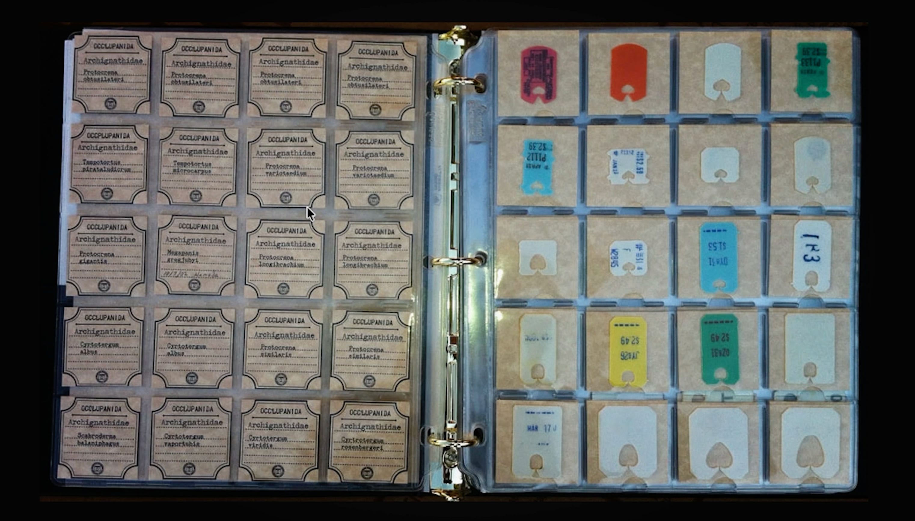
The occlupanids idea took off, TikTok started popping off on the subject, and there was a YouTube documentary featuring HORG about how the internet invented bread-clip science.
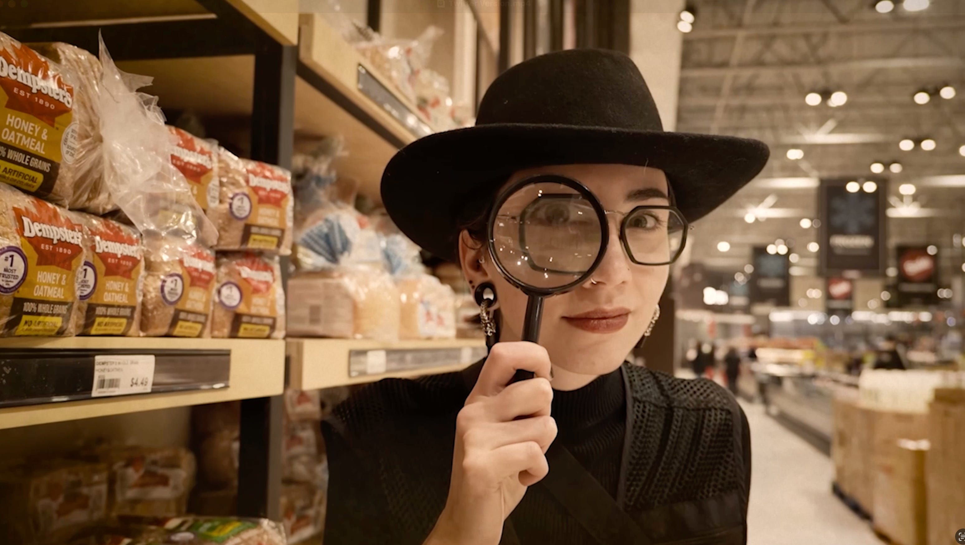
We all know the little bread clip is designed to be overlooked.
However, the second people pay attention to it, notice it, start crafting with it, it escapes containment and becomes a tiny piece of culture itself.
Receipts became fandom.
Let’s take a look at the next specimen: the receipt.
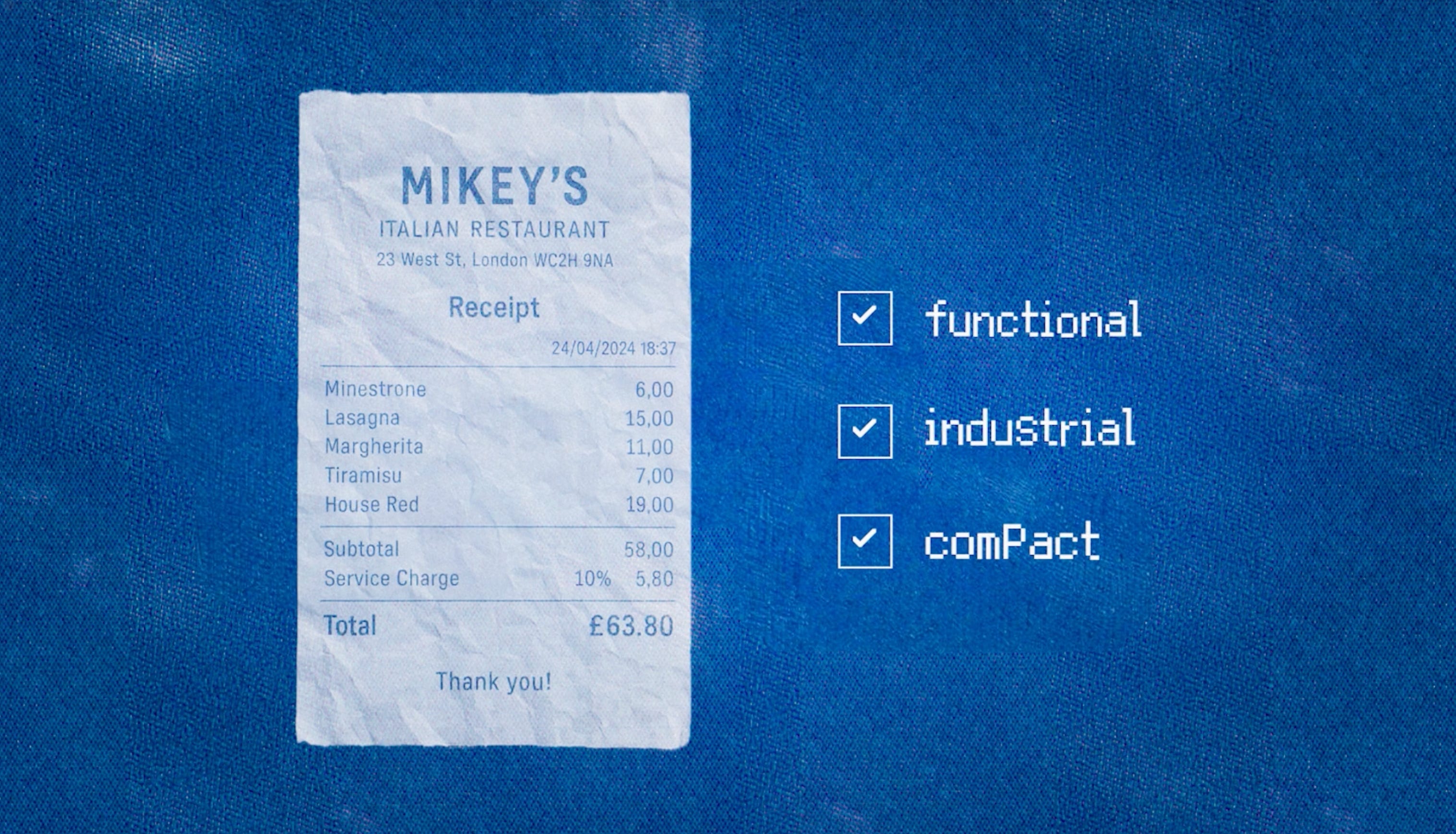
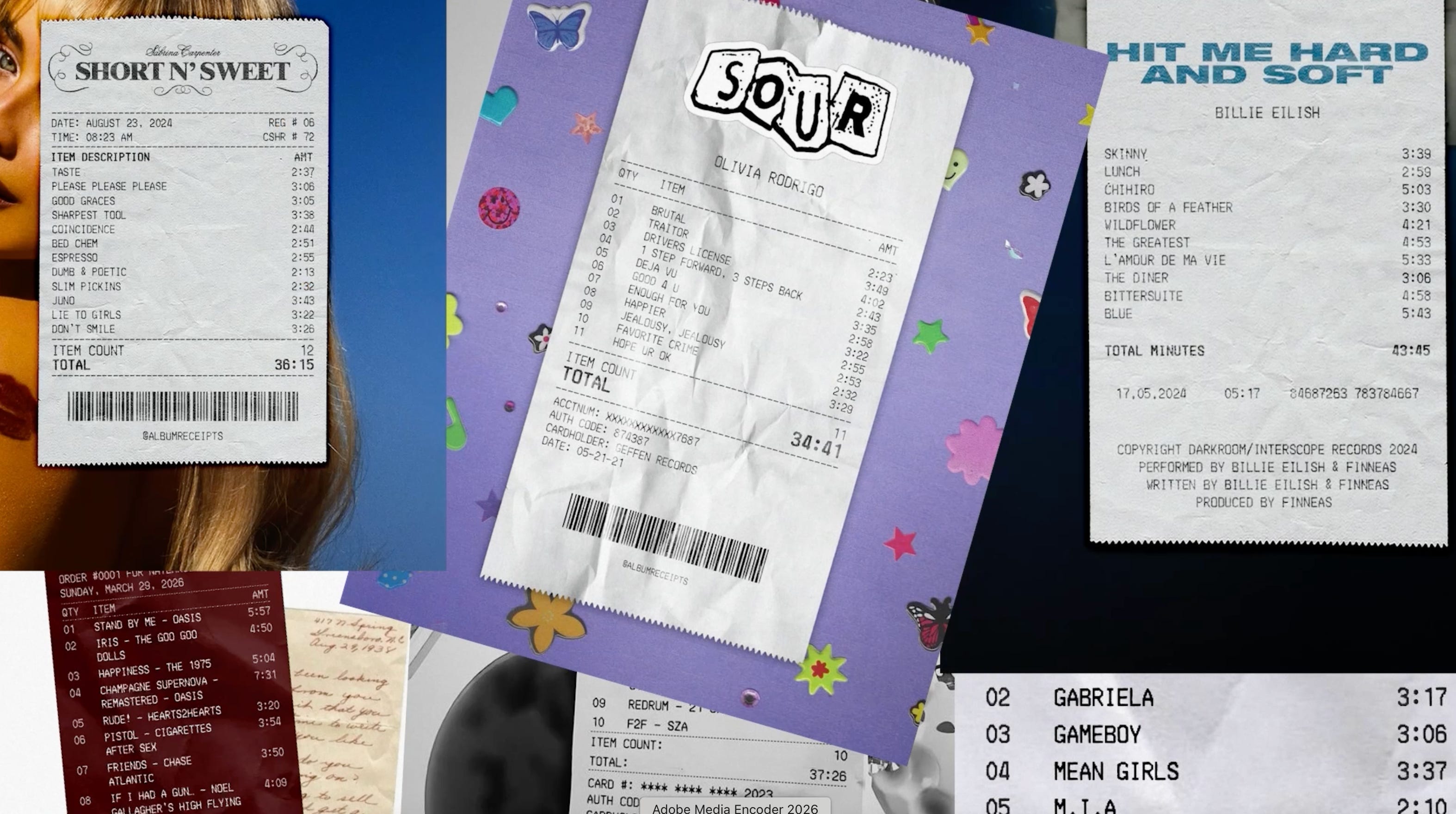
You might have noticed that the receipt has gotten tangled up with music.
It started with Receiptify, an app created by a college student that turned your listening history into receipts. Within its first month, the app generated one million receipts. It sparked TikTok trends, new categories of merch, and was even adopted by major labels like UMG as an official way to present artists’ albums.
You also see specific artists using the receipt in ways that go fully viral. When Charli released her BRAT vinyl, her fans were extremely confused.
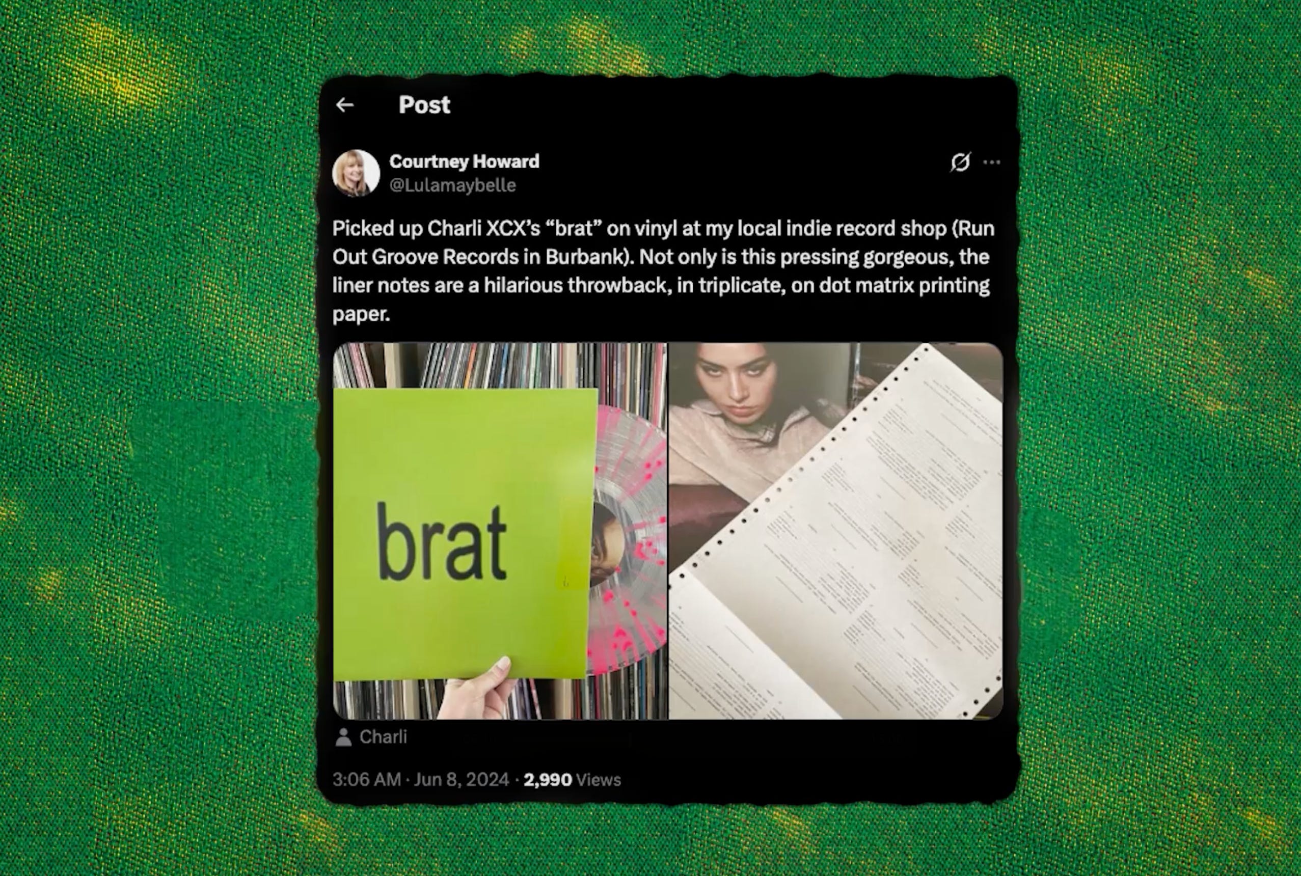
They started to ask whether they had received a mistake: this is the exact thermal paper you get on receipts. Later, the design firm behind BRAT posted this BRAT art book, designed to be destroyed—more dot matrix, more receipt-vibed-out. It was based on the receipt, and it won big: Best Recording Package at the Grammys, as well as Wallpaper’s design award, which specifically singled out the receipt paper.
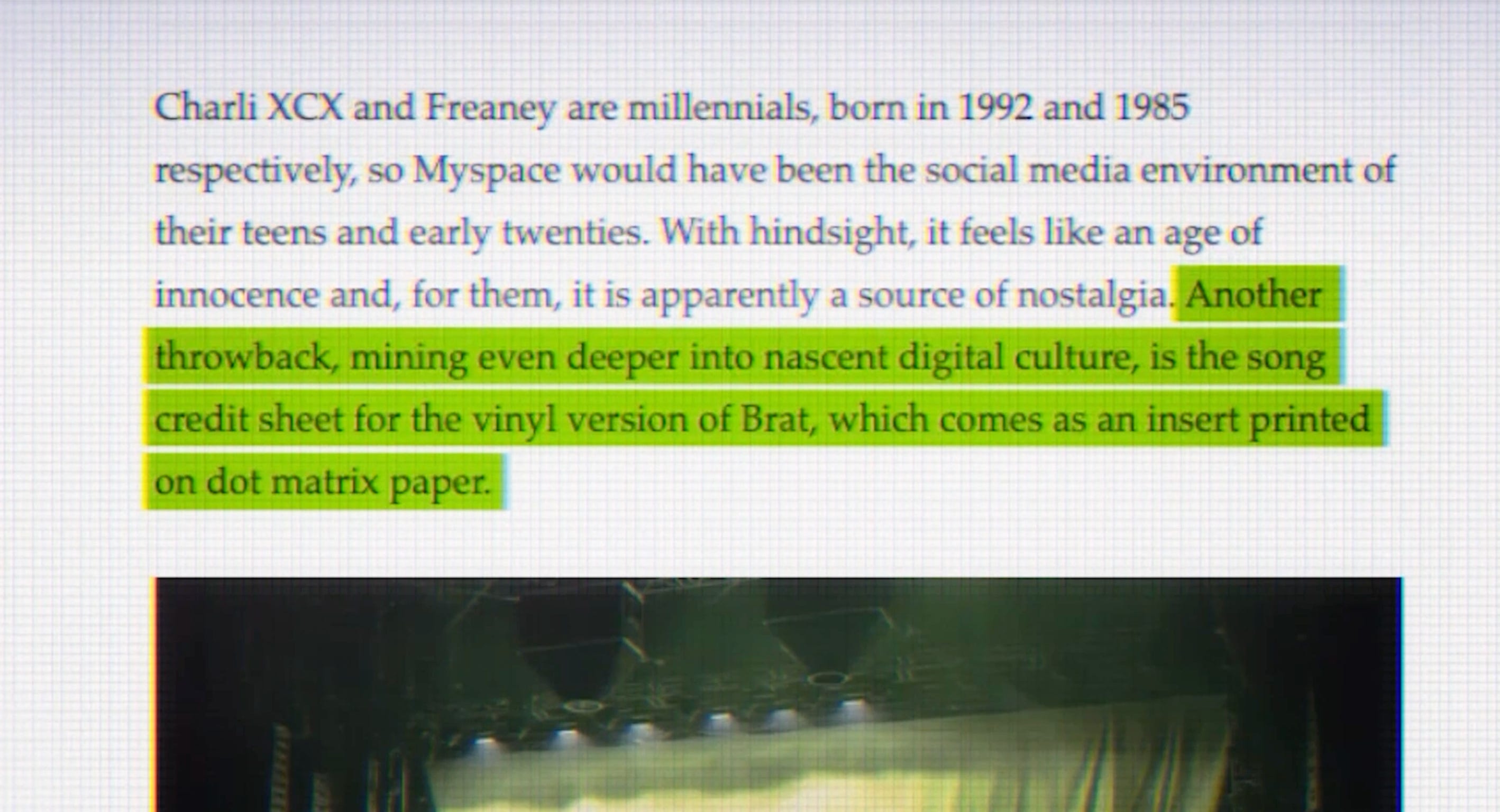
Receipts have reached upper echelons of music culture.
Receipts have become fandom itself.
Care labels became brands.
There is one final specimen to get through.
Think about the last shirt you bought. You probably immediately pulled off the tag and didn’t give it a second glance.
Now think about the new Nike app, the UI of your new running app, or the new moisturizer you brought home from the store. What did that brand look like?
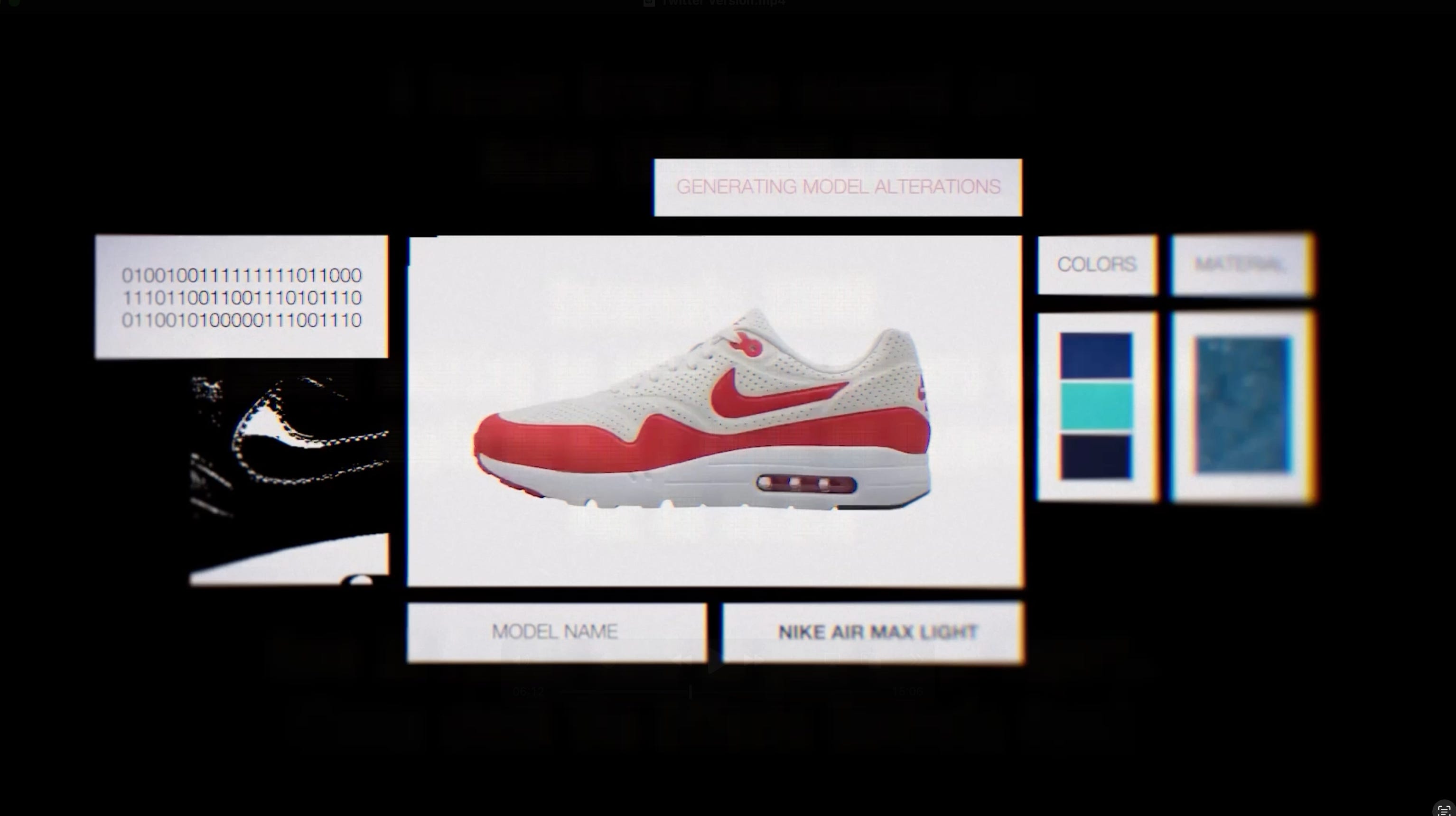
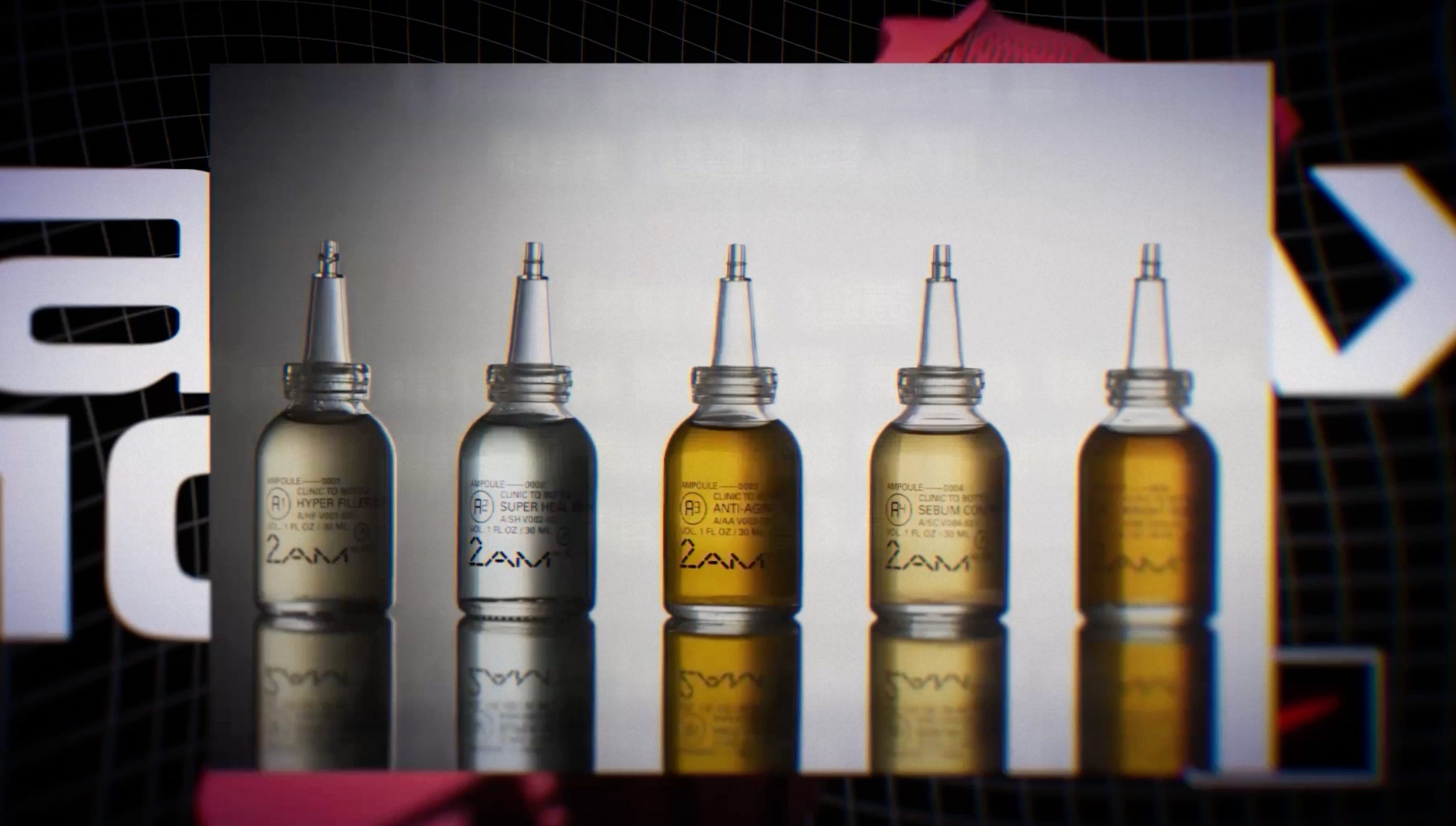
It’s the care label.
The care label has become common across more industries than not: from performance to beauty, fashion to technology.
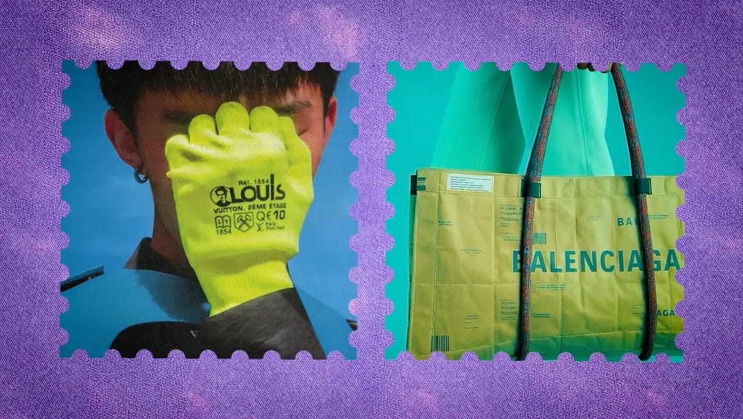
Nike, for example, has brought its care-label aesthetic to a global scale. Every sub-brand carries echoes of the care label: Nike ACG, their outdoor gear; Air Max 1000, their futuristic 3D-printed sneaker; every Nike collab ever.
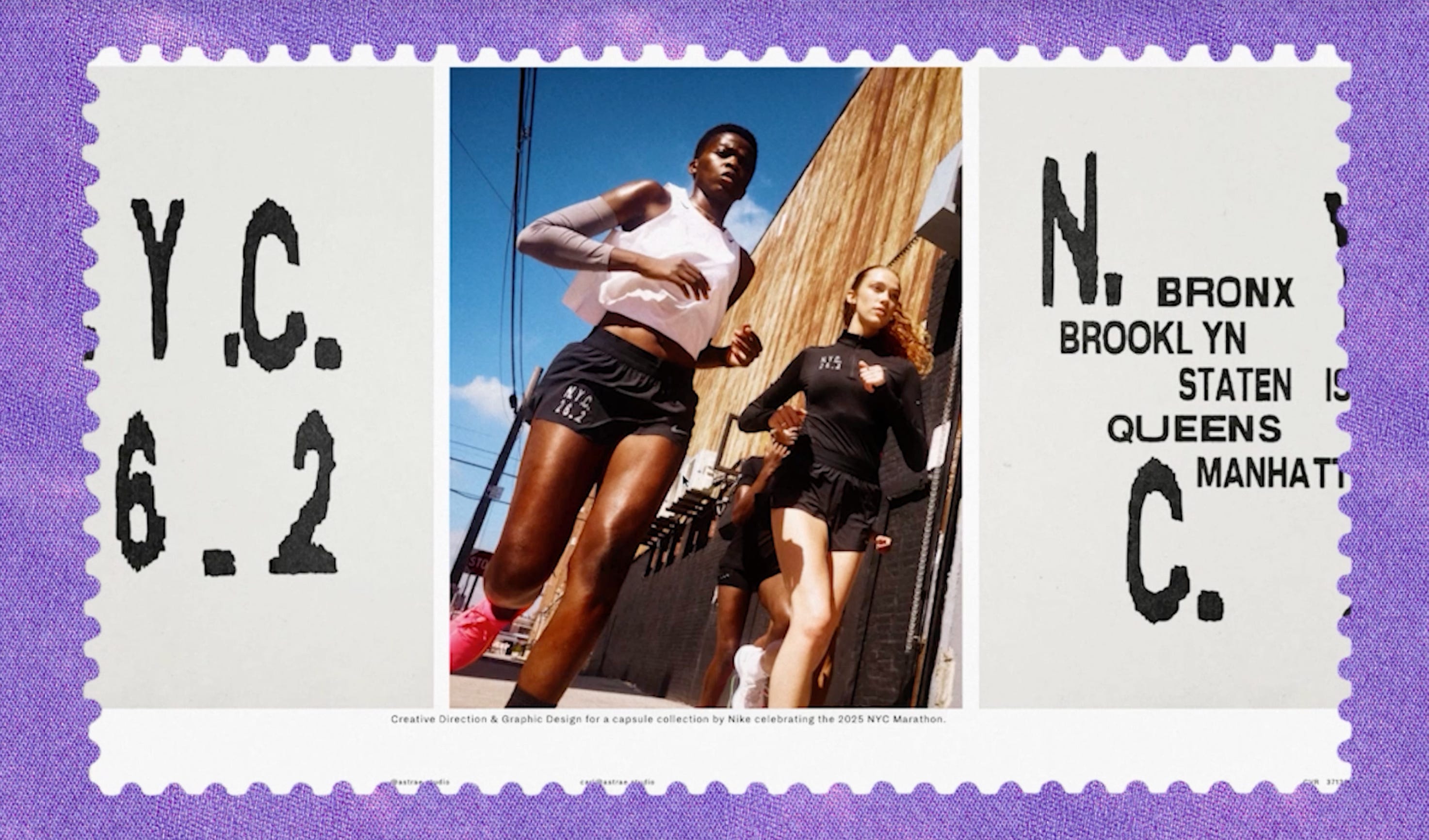
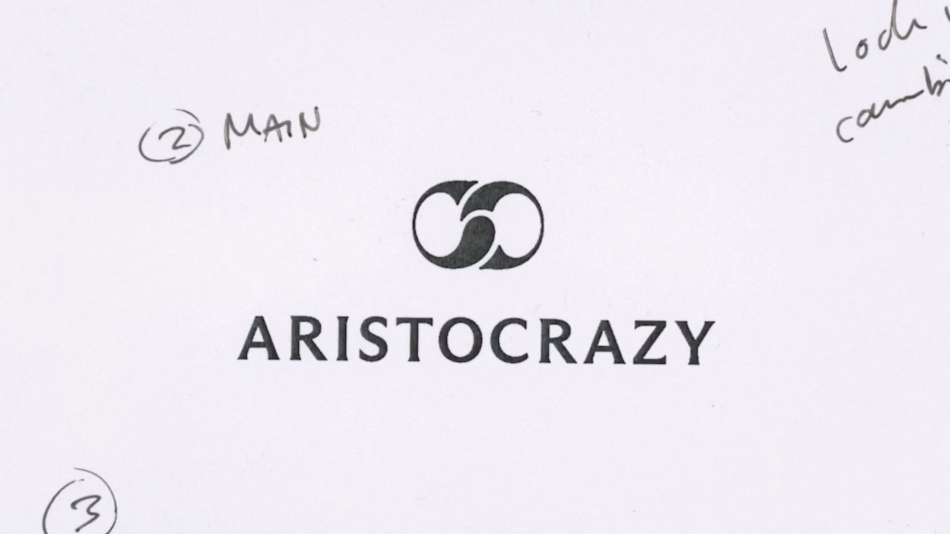
I also want to highlight the work of more indie studios drawing upon this aesthetic.
One of my favourite design studios, Daily Dialogue, oozes the care-label identity in its work.
The care label aesthetic is again being called so many things, from micrographics to the aesthetics of technical information to automotive normcore.
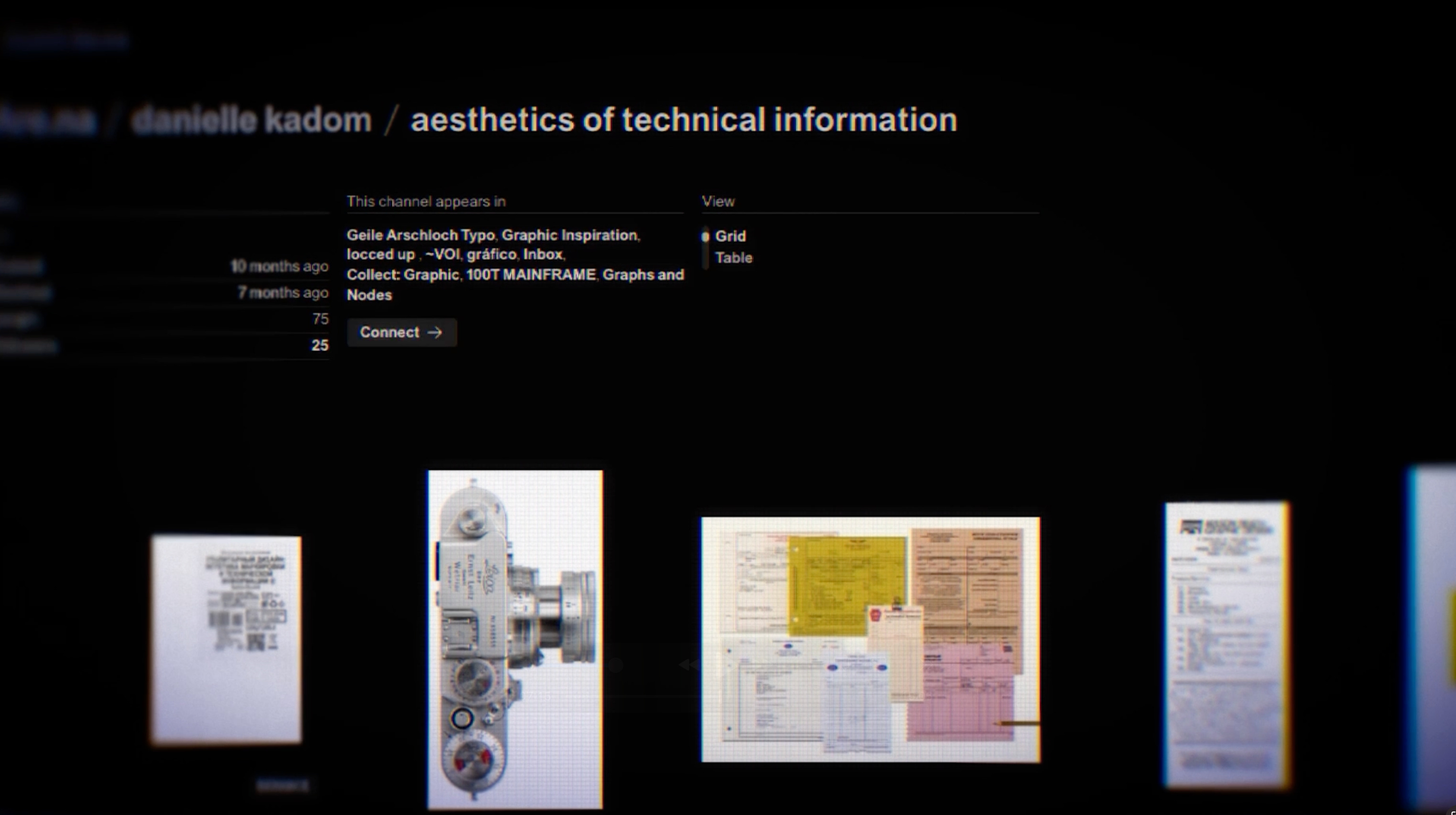
So, as you can see, care labels—systems of information in their simplest, most honest form—have become aesthetic.
The history that led us here
Why is all of this happening? Why are the scraps from different parts of our lives shaping art, music, and culture?
Let’s go back a bit, because when we do, things start to click into place.
The early internet was like an unexplored ocean. People built on it and tried to explore it, but it was hard to connect with each other except through hyperlinks. The islands became fun. They became personal. Over time, little islands built bigger and bigger communities.
But that exploratory feeling fundamentally changed with social media: MySpace in 2003, Facebook in 2004, Instagram in 2010—with the one feature that really changed an era: filters.
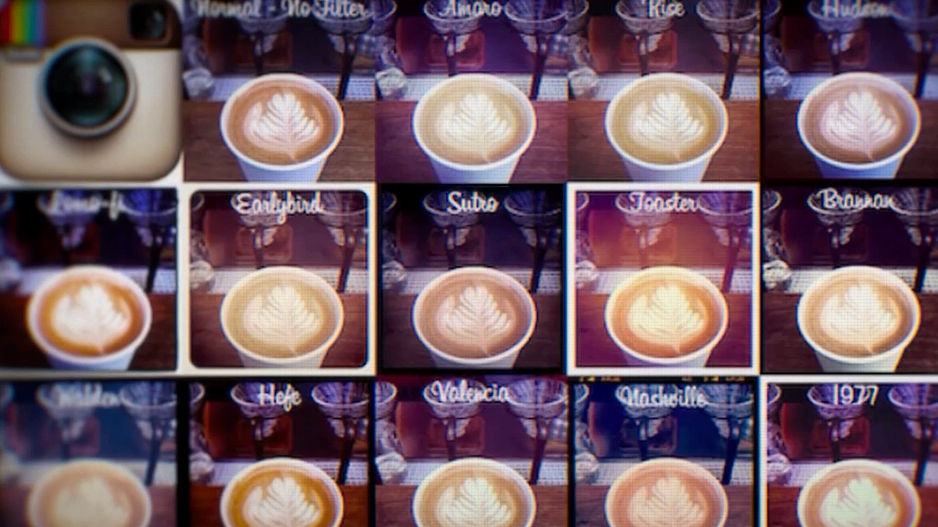
For the first time, anyone could post anything that looked polished. Subject to the algorithm, we realized we could optimize how polished we were to perform better over time.
Brands realized this too, birthing influencer culture.
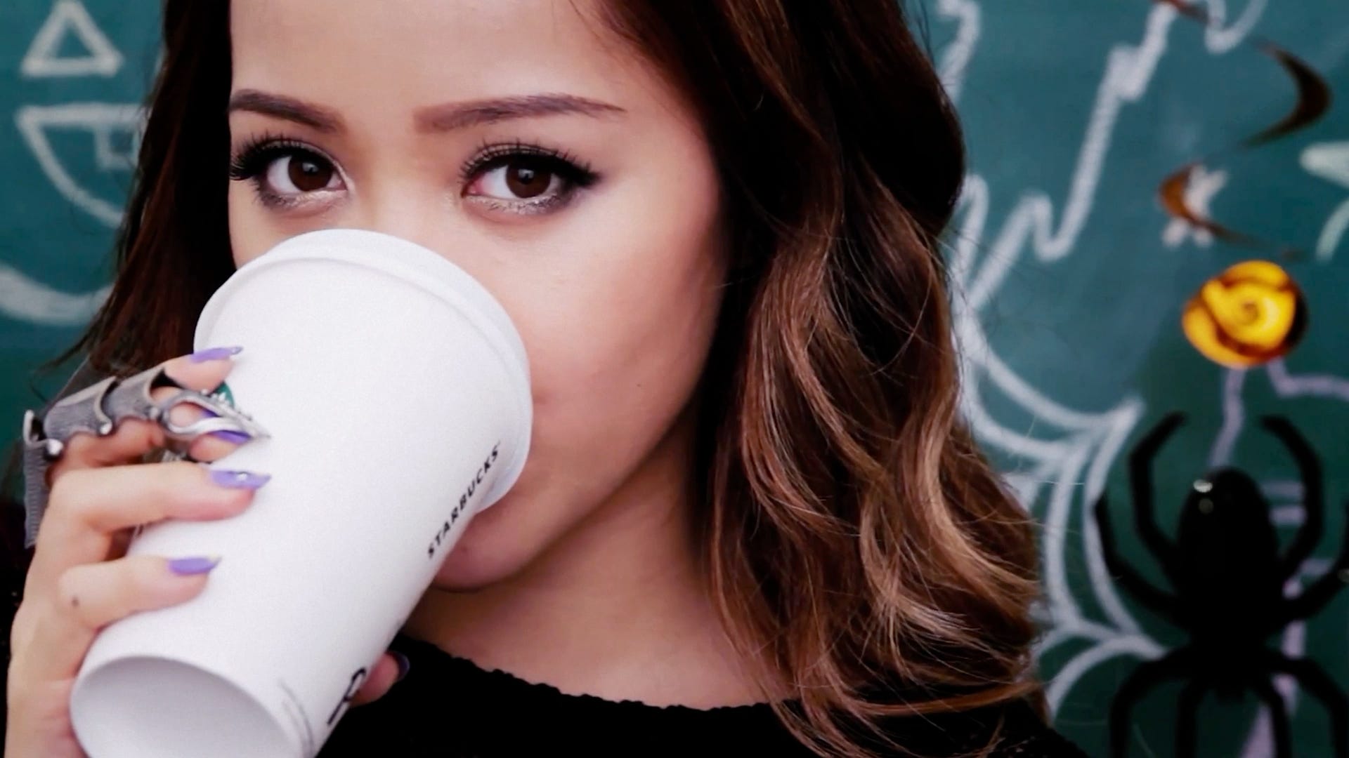
And the message was subtle, but we always felt it: you’re being watched, so make it look good.
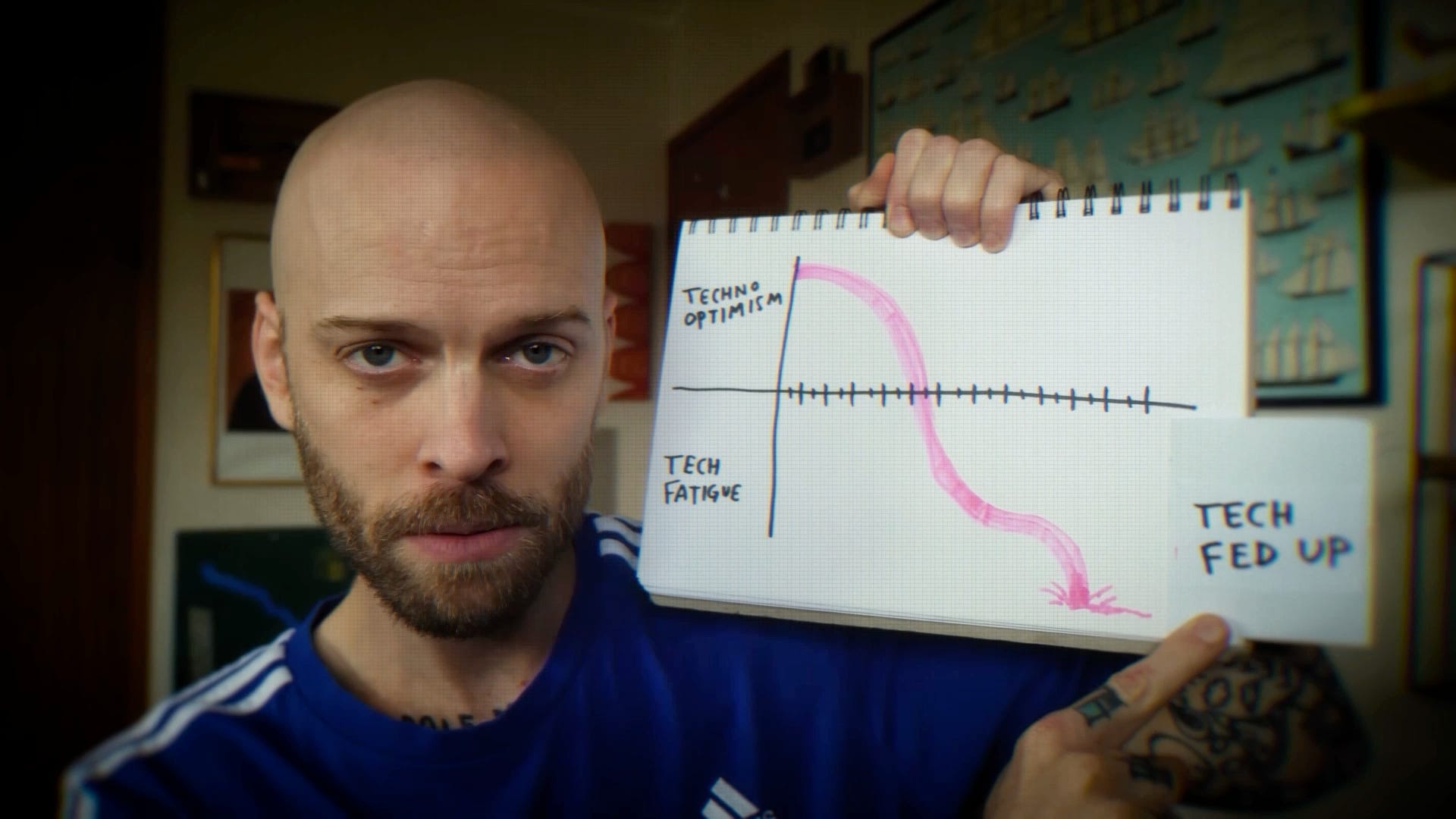
But we were tired. Tired of pretending to look perfect. Until tech fatigue became tech fed-up.
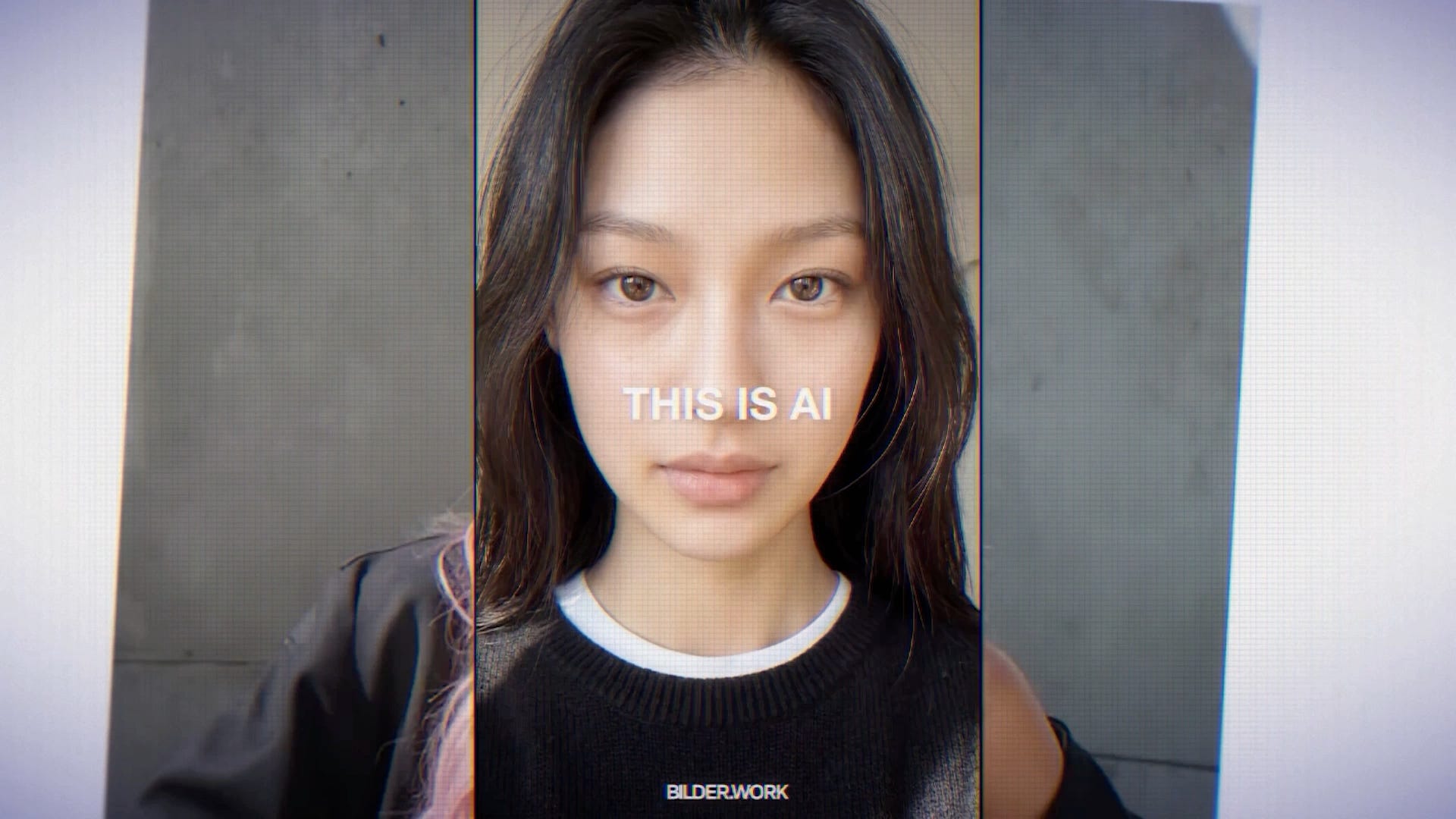
In 2022, we saw the absolute explosion of something more than polish: perfect faces that didn’t exist.
People started to revolt by moving in the opposite direction. While AI music became a thing, vinyl sales soared. While AI design became possible, anti-design—which rejects traditional ideas of good design—spread. While making AI art became easy, junk journaling made a massive comeback.
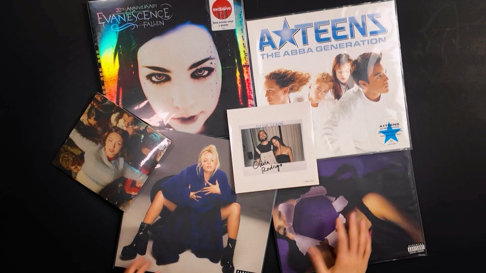
We used to call polished visuals aesthetic. Now we call them slop. We used to call unpolished visuals sloppy. Now we think of them as cool. What an interesting reversal of culture.
With all of this history, it makes sense now.
There are three main reasons why micro design is resonating so much right now, and they have very interesting implications for what the future might look like.
The Future
First, we are craving honesty.
Right now, every post, every pixel, is designed to optimize for your attention. On the other hand, this little thing exists just to tell you what it does. It’s not there to sell you something or make you take an action. That lack of an agenda now reads as rare, and therefore precious. The objects not asking for attention suddenly feel like the only ones we can trust.
Second, we’re seeing a shift towards the hyperlocal.
AI generates from patterns and probabilities; that’s why so much AI content feels rootless. You don’t really know where it’s from or where it belongs.
But a bread clip? This is no average. This is radically unlikely. Take a look at its taxonomy: the time and place it was made. No optimization function would reward generating these specific numbers, this specific shape and color, which tells the grocery stocker which day it came from. Microdesign is grounded in time, place, and context. We’re already seeing the world skew toward hyperlocal, curated experiences. Hyperlocal details don’t just add character; they become proofs of life.
But here is what I think is the biggest shift. For centuries, creativity meant producing something: producing art, music, writing. But now, when production becomes infinite, the creative act is no longer production. It is now about noticing.
While AI can generate anything endlessly, it cannot decide what is worth paying attention to. When someone devotes their attention to a bread clip, a care label, or a receipt, they’re deciding that this overlooked thing is worth remembering—even if no algorithm would select it and no optimization function would reward it. Microdesign is the perfect artifact of noticing.
I love this quote from John Daniel, the founder of HORG—the guy who coined the whole term “occlupanids”:
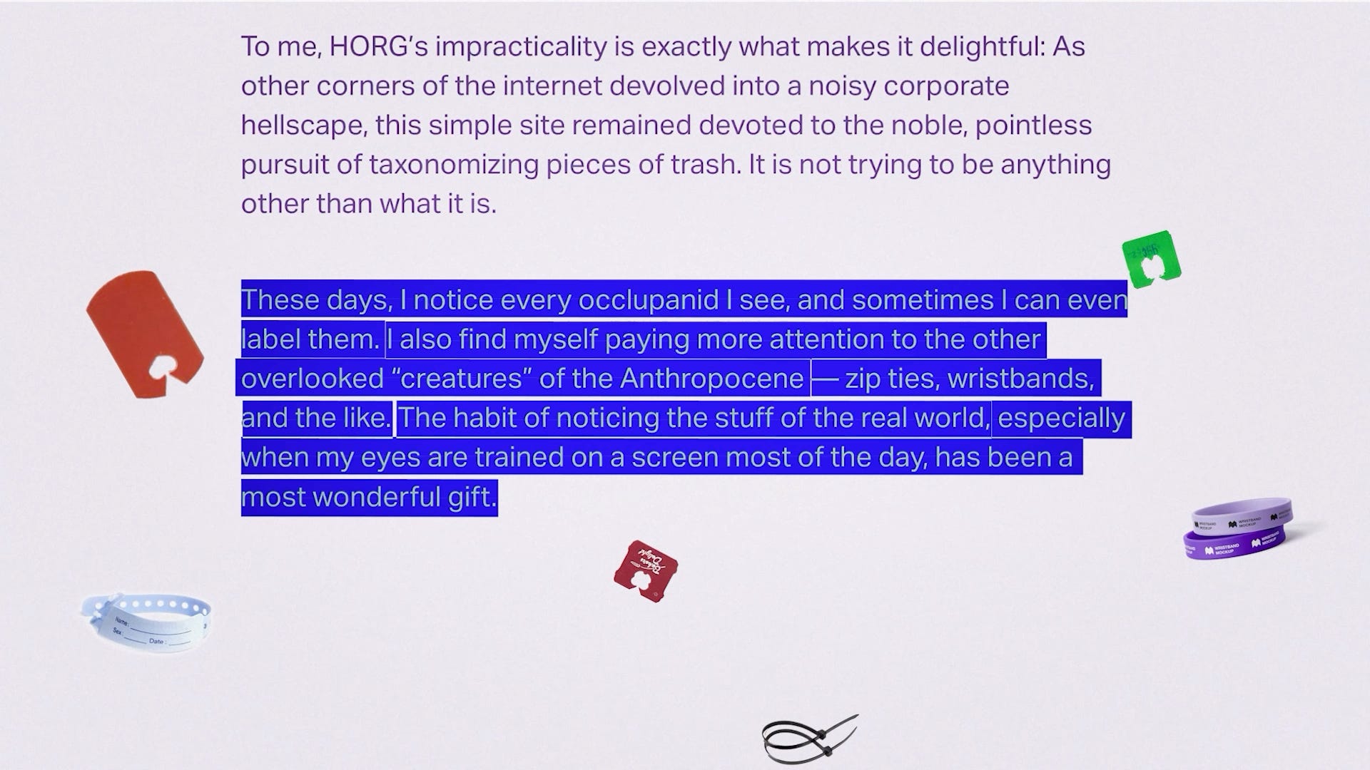
In an attention economy, where everything is expected to justify its worth, celebrating the things that don’t becomes an act of rebellion. It says: I prefer this ugly thing, thank you very much. I choose to notice it. And in a world flooded with content, the act of noticing might be the most human thing left.
An unpolished year
So, we’re entering an unpolished, hyperlocal year—where, as things feel more rootless, we seek whatever roots us in time and place. Those breadcrumbs back home. There’s a growing rebellion in how we define cool, where the question changes from “What’s trending now?” to “Who says this is beautiful?” The answer feels increasingly clear: it’s still in our hands.
2026 might be the year we start looking again at the ordinary: finding charm in small, overlooked things; beauty in the byproducts of use that were never meant to be beautiful in the first place. Microdesign captures this shift because, in a world of mirrors, polish, and averages, it’s the humble bread tag—distinctive, local, imperfect—that unexpectedly becomes a badge of cool.
And I think that’s a hopeful sign: that we’re learning to find wonder and meaning in the things that make us human, because we are finally learning how to notice them.