
Polish is Dead. Long Live the Bread Clip.
How micro-design is becoming the defining aesthetic of 2026

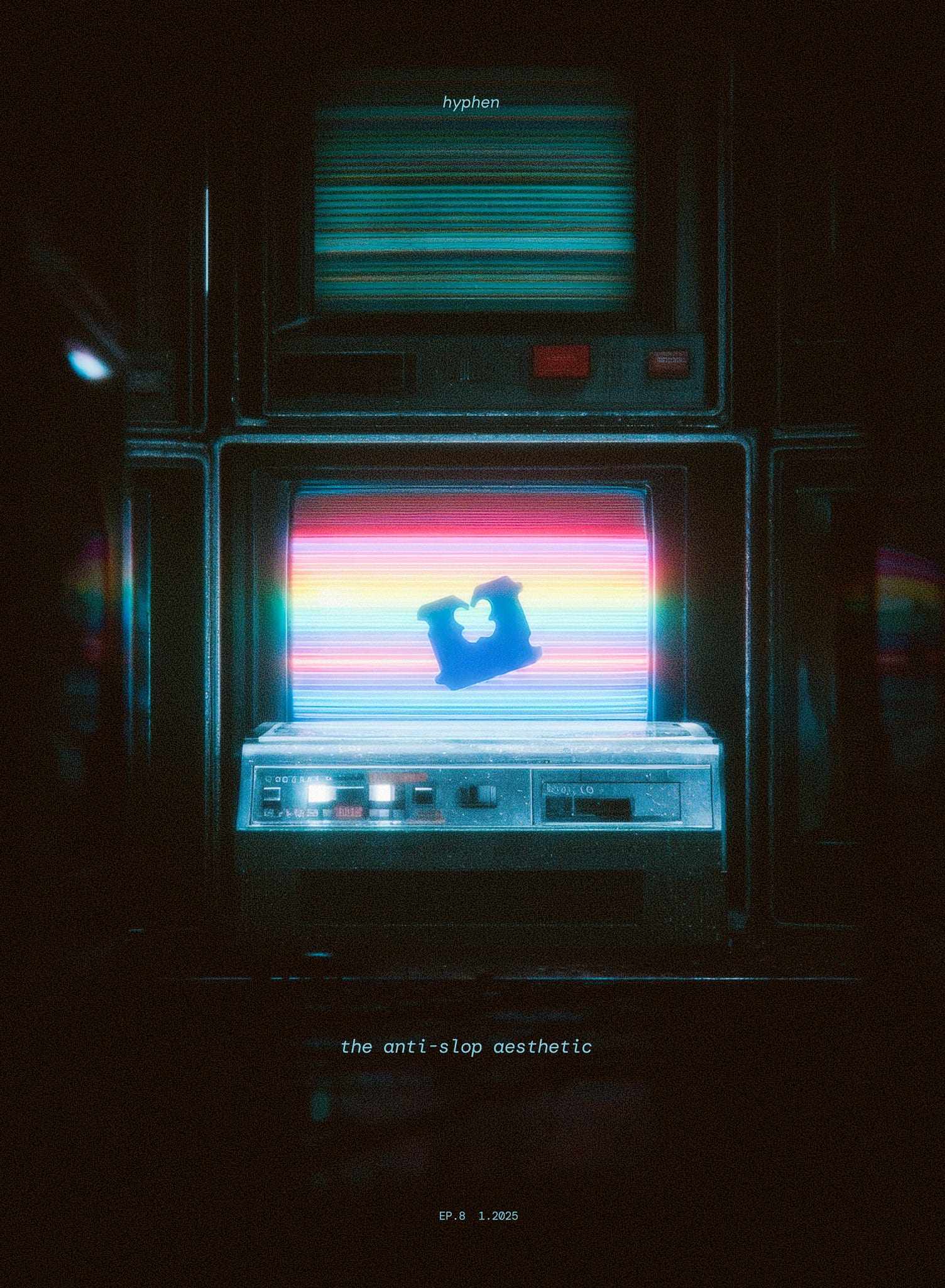
A big movement is brewing, and in the smallest of objects.
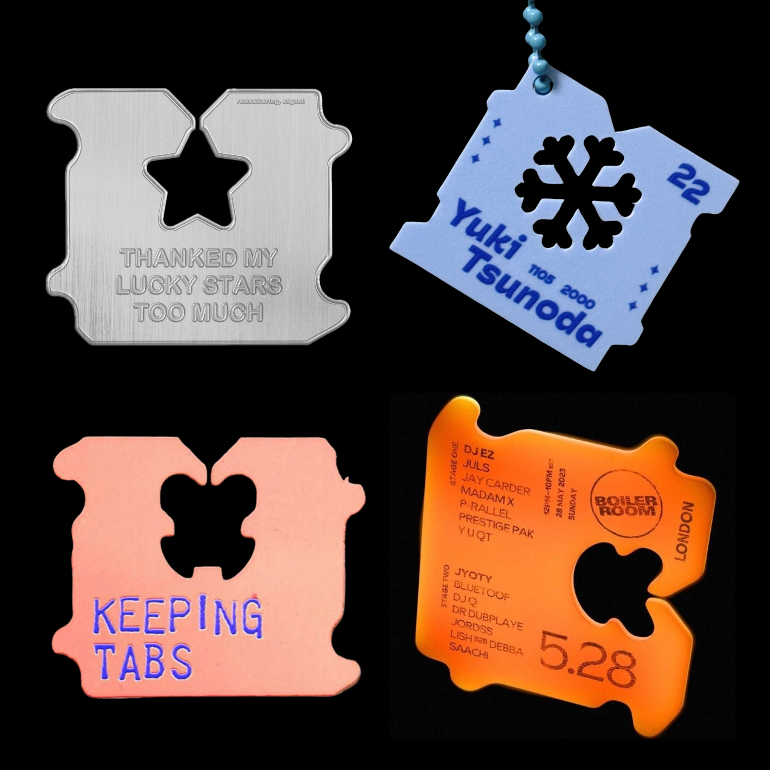
Bread-tags have become collectibles.
Care labels have become brands.

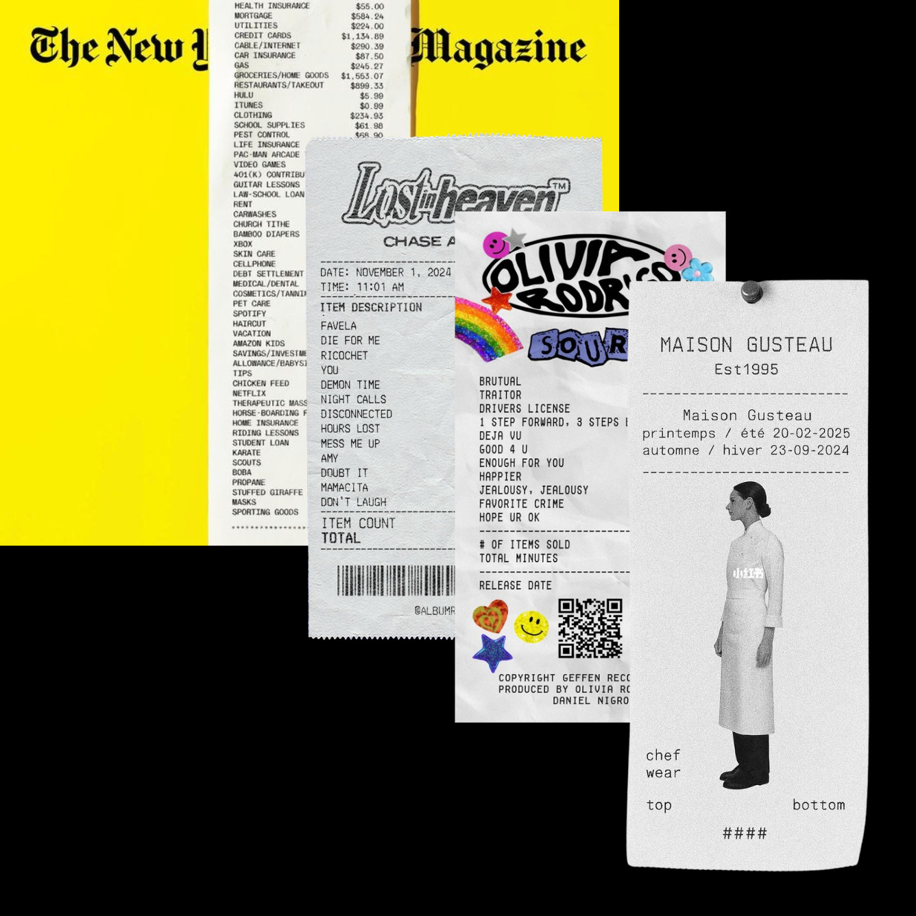
Receipts have become culture.
The recent technological shift has reshaped creativity, and there are whispers of a new aesthetic age.
However, this feels like a collective glance downward.
Into the ephemeral.
The discarded.
Why are we suddenly captivated by the fragments we were never meant to keep—and what does it all mean?
What This Is
Let’s talk about what this aesthetic is.
The tricky part, though, is it doesn’t really have a name. At least, not yet.
You’ll hear people calling it different things.
Ephemera
Micrographics
Functional design
Micro-industrial
-and more.
When a new visual language has many names, it means a shift in culture is happening faster than our language can keep up with.
For now, let’s call it micro-design: the design of things that are unapologetically honest about where they come from.
That honesty shows up in two ways.
The visuals. Micro-design strips away all non-essential decoration, leaving only the “guts” of information: the text, the icons, the numbers.
The materials. Micro-design is made of unpolished industrial materials, which it doesn’t try to hide. You don’t pretend a bread tag is precious plastic or that a receipt is archival paper. Micro-design is cheap, raw, and unapologetically useful.
We were never supposed to notice micro-design.
We were supposed to hold them in the margins of our attention, where they would ubiquitously serve our needs.
Yet notice them we did.
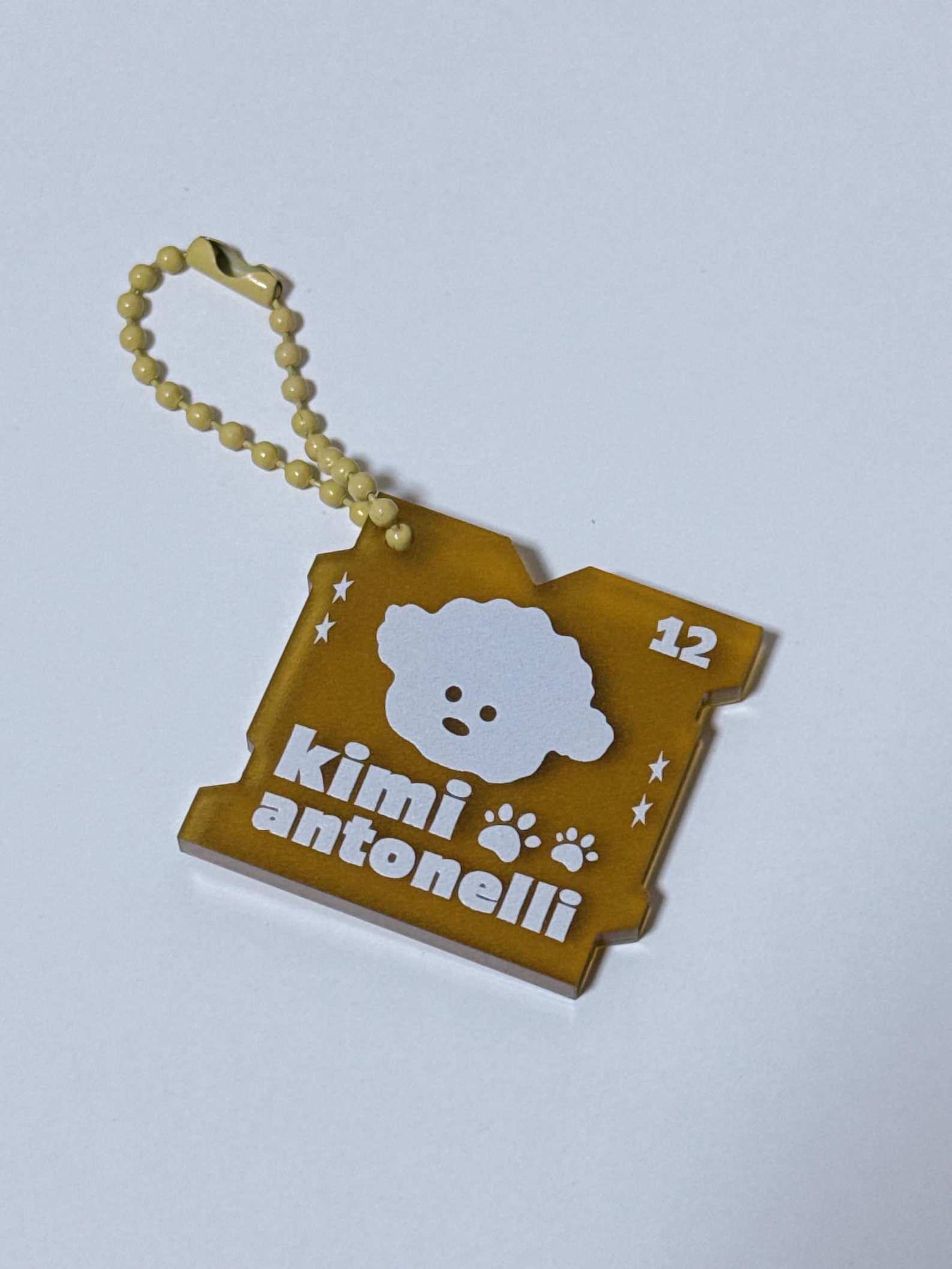
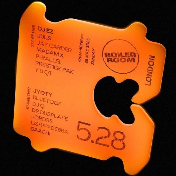
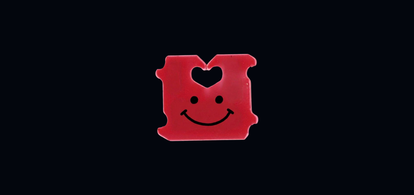
The Bread Clip
Artists have started illustrating with bread clips. They would craft with them, merging them with the visual language of fan cultures like F1 and K-pop.
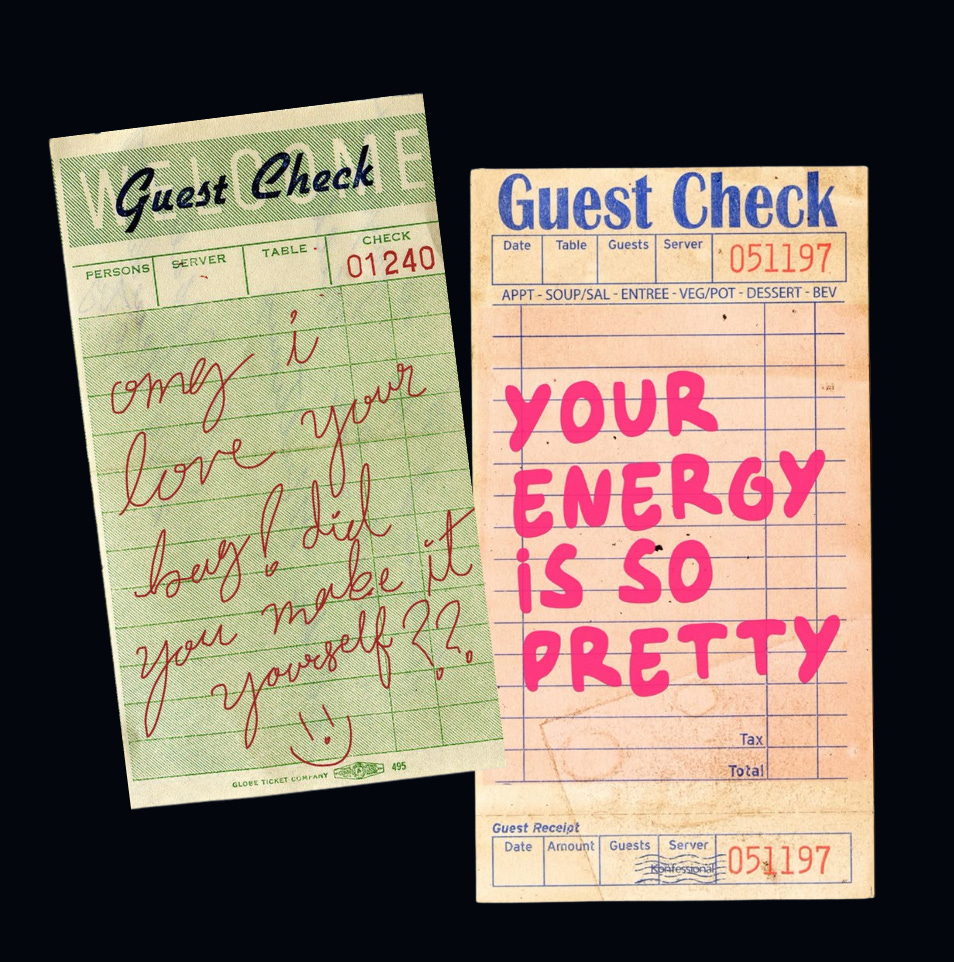
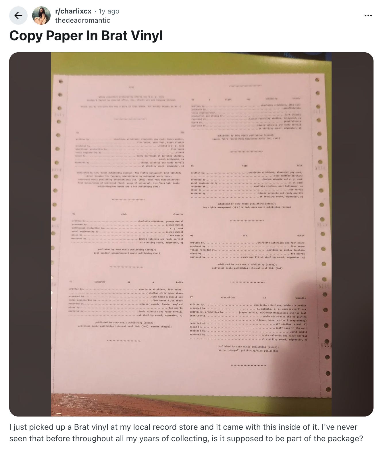
The Receipt
Last year, people started turning restaurant receipts into poster and canvas art sharing intimate messages, a trend that went viral across Tiktok and Pinterest.
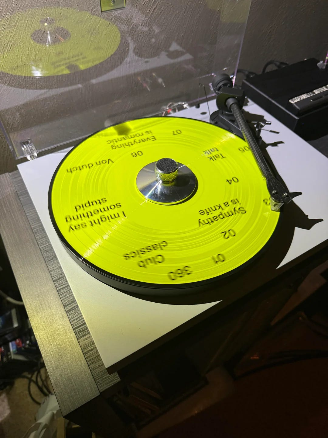
Artists like Charli XCX released her brat vinyl credits on dot matrix paper, which receipts are printed on, to the initial confusion of her fans.
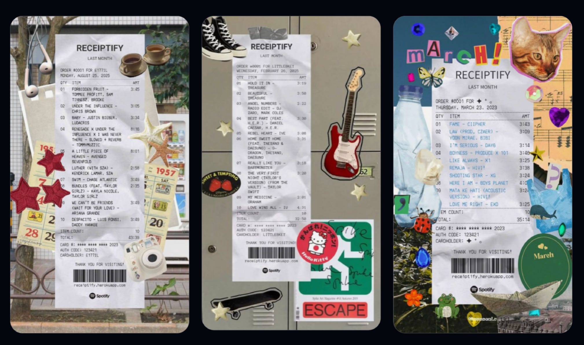
Millions of people downloaded apps like Receiptify to reformat their listening history as receipts.
Think about that for a second.
Millions of us chose to frame something we care deeply about—our taste, our identity—in the most throwaway representation possible. What does that say about the way we like to express ourselves?
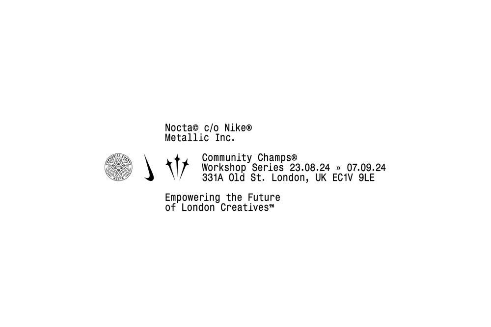
The Care Label
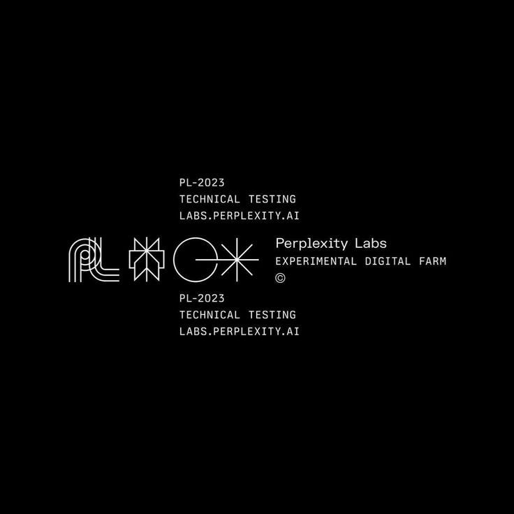
There’s another format that’s recently taken over the tech and fashion world: the care label. What tells you how something should be handled, interpreted, stored.
It’s unmistakeable in Perplexity’s branding, where the logos appear like washing instructions.
It shows up boldly in new Nike campaigns.

It breathes in the logos of newly-opened design studios.
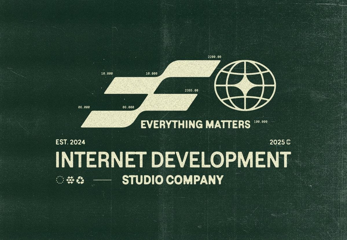
Serial codes and timestamps, systems of information at their most primitive, have become style itself.
Why Now?
To understand why we’re gravitating toward micro-design, we need to zoom out a bit.
it started with a decade of exhaustion.
The Polish Era (2010-2020)
You’re being watched, so make it look good.
For the last decade, we’ve lived inside filtered, hyper-curated worlds. Perfect feeds. Perfect branding. Perfect lives, constantly optimized by targeted digital advertising to do one thing: make you feel like you’re behind.
The context makes sense. In 2010, Instagram launched and turned identity into performance. Digital advertising went mobile, following us into our pockets. Social ads quadrupled from 2010-2015. Every click was tracked, every scroll analyzed.
In an online world optimized to make money from our attention, polish reigned.
Then something changed.
The Slop Era (2022+)
What started as tech fatigue turned into-
2022 was the year of the AI breakout: ChatGPT, Stable Diffusion, Midjourney, DALL·E 2, all within months of each other.
Think about what that means: the thing we’d spent a decade perfecting—polished content—could now be produced by anyone.
So the internet flooded with AI imagery. Too polished, this time. The kind of output we started calling “slop.”
If synthetic could masquerade as real, we could not trust polish any longer. Imperfection therefore re-emerged not as a flaw, but as a marker of increasingly-scarce authenticity.
That shift set off a snowball effect.
Design started to feel more handmade again.
Anti-design
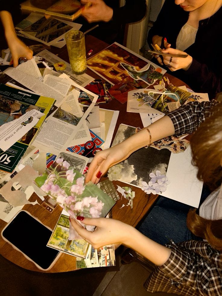
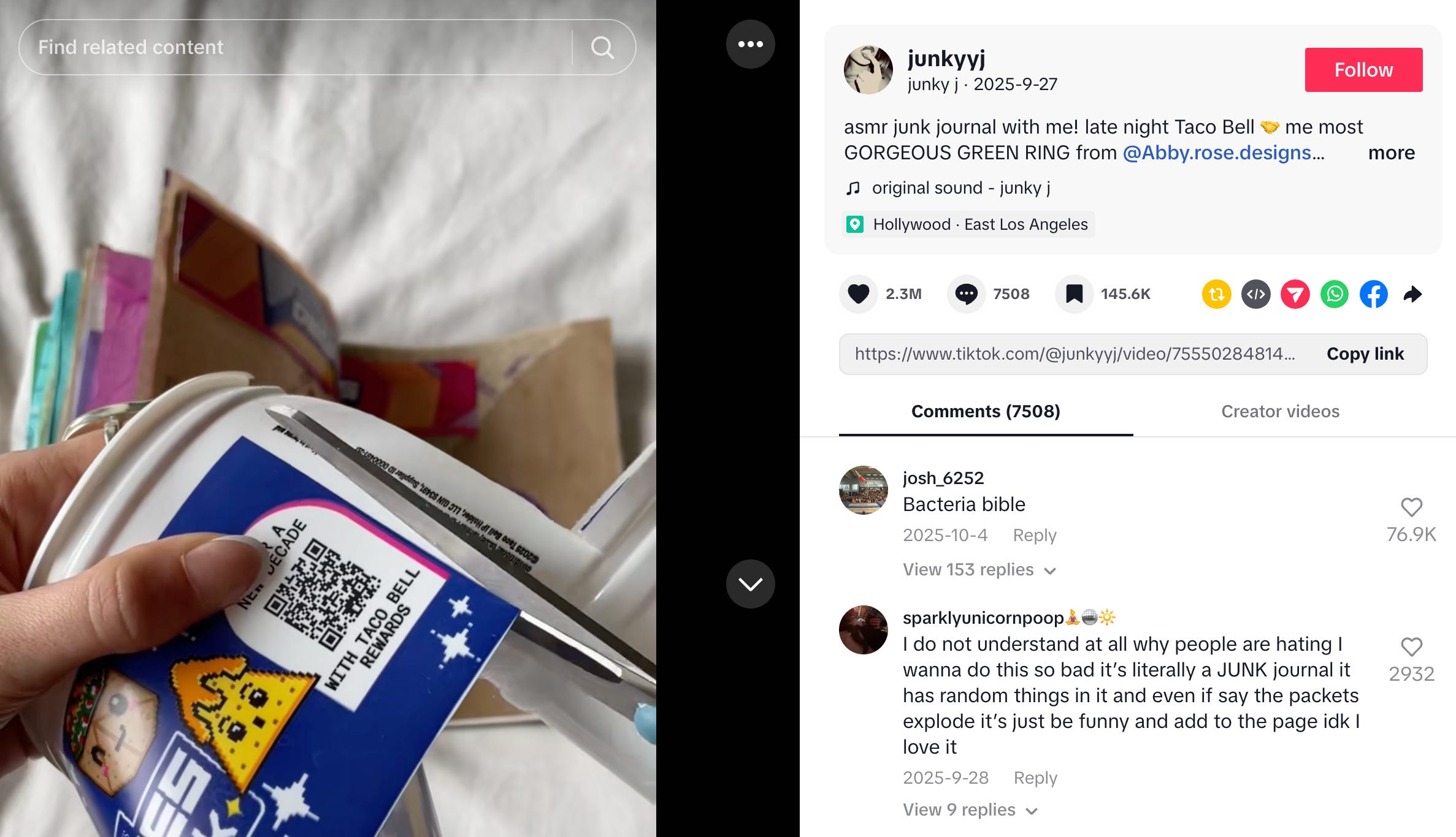
Cut-and-paste layouts. Rough edges. Things that looked assembled instead of rendered. For example, junk journals, books built from receipts, tickets, and other scraps, hit 3 billion TikTok views in 2024 and remain widely replicated today.
Sit on this reversal for just a moment.
Unpolished visuals, which were once considered “sloppy”, have started reading as cool. Meanwhile, polished AI visuals have became, quite literally, called “slop”. A complete inversion of value.
Micro-design becomes the perfect vessel for this moment.
Three reasons.
1. The Shift Towards Hyper-Local
Look at this collection of AI-generated flowers.
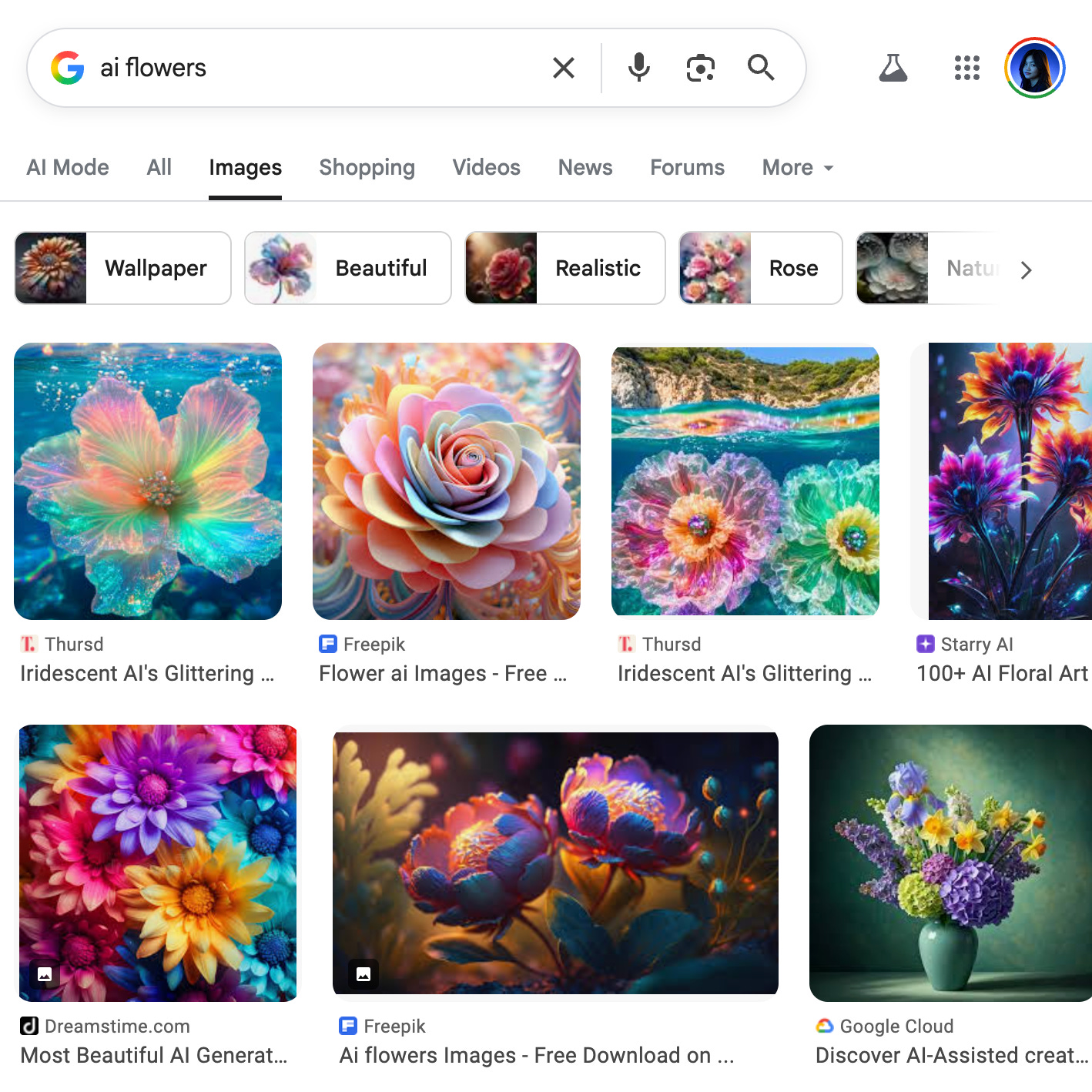
AI generates from patterns; outputs tend towards this sameness.
But a bread clip? No function rewards generating it’s taxonomy: the time imprinted on it, the shape and color that indicates where it was made.
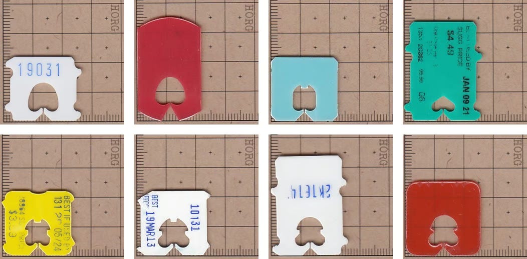
Micro-design elements signal grounding in time and place.
That hyperlocality becomes proof of life.
2. The Shift Towards Honesty that Shows It’s Seams
Everything online begs you to prove its worth.
Every post, every pixel, is engineered to capture your attention. To keep you scrolling. To make you want something.
On the other hand, a bread clip exists just to tell you what it does. That lack of an agenda now reads as deeply honest in a way we forgot things could be.
And what happens to things that become rare? They become precious.
3. The Shift from Making to Noticing
For centuries, creativity meant making things. Now, when making becomes infinite, the creative act shifts: it’s no longer making.
It’s noticing.
We can generate anything now; therefore the creative act is deciding where we should direct our attention.
The receipts, the bread clips, the industrial tags are artifacts of human attention. Someone cared about something was supposed to be invisible. Decided that this overlooked thing was worth cataloging, naming, remembering, when no algorithm would select it. When no optimization function would reward it.
What we’re responding to is not just the objects themselves, but the fact that someone chose to notice the specific shape of a bread tag.
The scribbles on the back a guest check.
The scratchy material of dot matrix paper.
When everything must justify itself worthy of attention, paying attention to things that do not require attention at all becomes an act of creativity.
I prefer this humble thing.
I choose to see it.
That choice is mine.
What’s Next
We’re entering an unpolished, hyperlocal year.
As the media we’re exposed to feel increasingly rootless, we’ll instinctively reach for things that root us in time and place. Small local markers that become breadcrumbs back home.
As the question shifts from “what’s beautiful?” to “who says this is beautiful?”, the answer feels increasingly clear: that choice is still in our hands.
So 2026 might be the year we start looking again at the ordinary.
Finding charm in the overlooked, honest things. Beauty in the byproducts of use that were never meant to be beautiful at all.
Micro-design captures this shift.
In a world of mirrors, polish, and averages, it’s the humble bread tag, local and imperfect, that unexpectedly becomes a badge of cool.
And I think that’s a hopeful sign: that we’re learning to find wonder again in the smallest things that make us human.
Because we’re finally learning how to notice them.
I would love to know what you’ve been noticing. Has any micro-design been resonating with you?
my water bottle read CELLO with steel like stickers, it happened twice that the 2L's kept falling off each time I stick it back.
Third time I dint cz I realised it's more 'my bottle' with the 3 letters remaining.
Thank you. I should 3d print some. I've always noticed the stamps at the bottom of brown bag like things and it says who approved it.